CAP 4 CAP 4 - Art Submission Thread

Status
Not open for further replies.
That doesn't even matter.

I'm not going to get into an argument over my own intentions.
However, criticism is allowed.

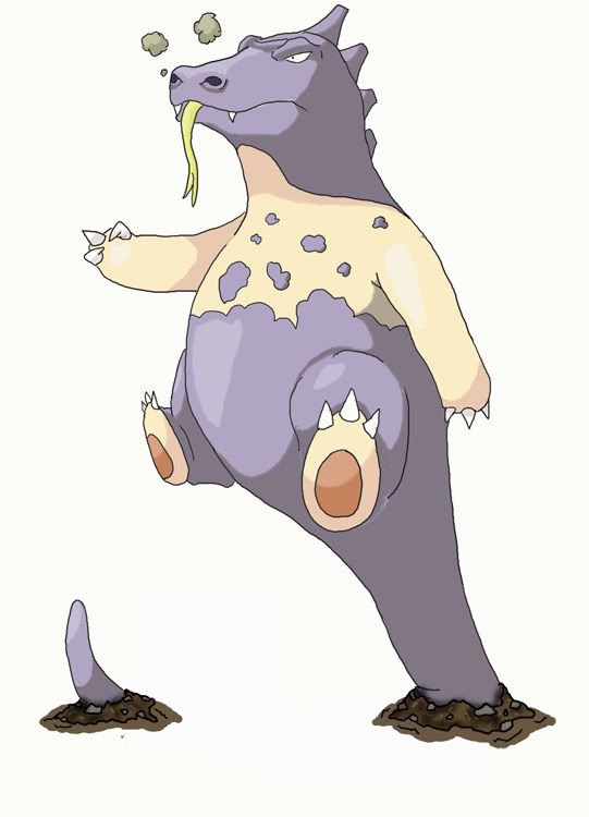
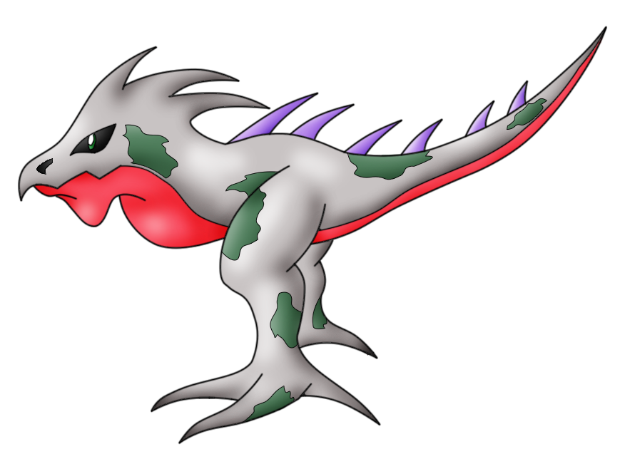
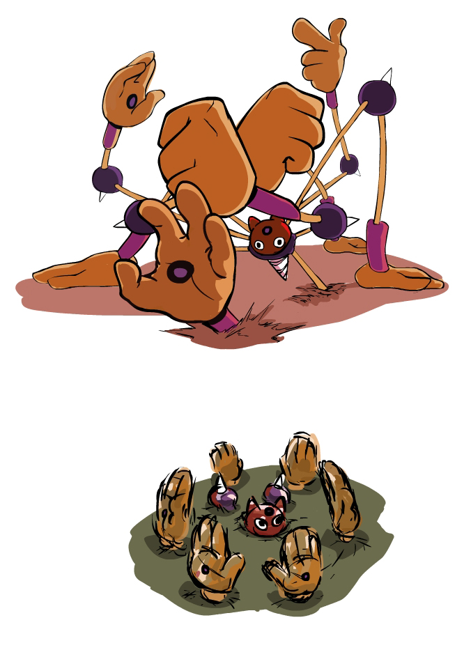
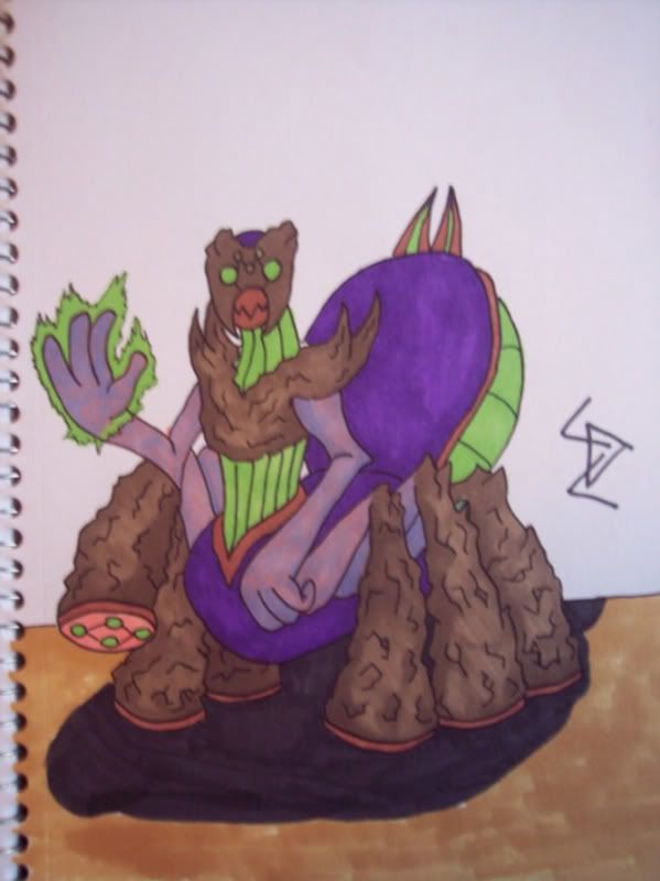
Several people have been criticizing cartoon's creature saying that it doesn't look like it could move at all.
It's just as welcome as any criticism I make. And you know what he does? He admits it doesn't seem feasible, but he makes an animation to prove them wrong. Well, if the artist doesn't like my criticism, he can try to prove me wrong.

And while we're on the subject, how did you scan the photo of your submission?
Did you take a picture with a camera?
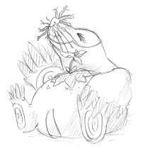
It looks really blurry and I can't make out any key features.
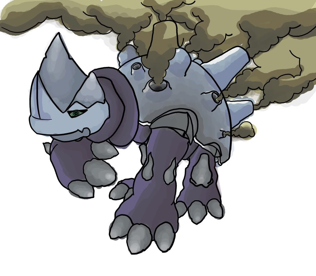
Try drawing it in paint. I use paint, and it's actually really usable if you take the time to work with it.
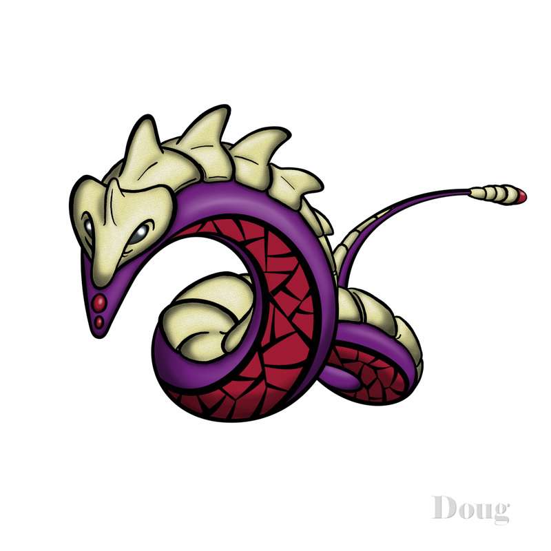
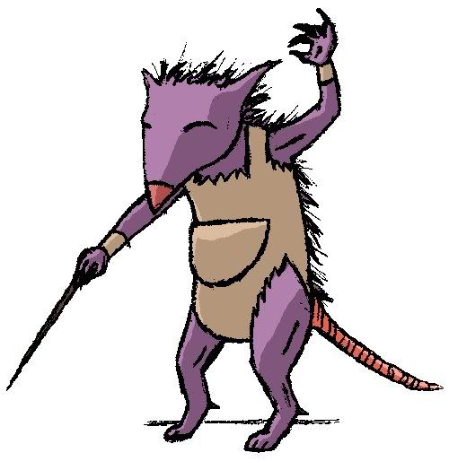
Just check my trade thread, my second post includes some pokemon artwork done in paint by myself.
 
Point taken, though similarly my opinion is my opinion and I'm entitled to say it if it has something to do with the topic. Your artwork is pretty nice, but I cannot draw anything in paint, much less than the "turd with spikes" I can manage on paper. Page 25 has a more "detailed" (That is to say a little bit less blurry) picture.
 
Unless we want to say that the Daddy long-legs is literally holding opponents down, then I think Gravity would be debatable.

*klunk*
I am struck with genius. This is exactly how it happens. The spider reaches into the ground. Then, a hand pops out of the ground and snags the opposing pokemon. Niether of them can move very well in that position, ergo reduced evasion for both.
 
I believe DJD's is still one of my favorite submissions.
Cartoon's Handyman is definately original and snagged me into it's design like everyone at first.
But the more I come back to the thread, the more I realize that I really would like to see DJD's as a design on shoddy.

Also, I agree that pokemon need not be "cute" or withing Gamefreaks perameters to be utility. Coming up with orignal/interesting/weird/badass designs just helps the creativity of the thread grow. The more varied the expressions and appearance of the pokemon the more we can look back and say we made a good final choice. I for one would love to have a thousand different and varying submissions and say I chose well than have only a handful of extremely awesome but albeit limited ones.

I haven't posted in a few days so though I would throw in my two cents while lurking a bit more and seeing where things will be leading.
 
*klunk*
I am struck with genius. This is exactly how it happens. The spider reaches into the ground. Then, a hand pops out of the ground and snags the opposing pokemon. Niether of them can move very well in that position, ergo reduced evasion for both.
But then neither can switch, which is not exactly Gravity.

I'm pretty sure it could get Block with all those hands.
 
Just my opinion but Daddy Long Legs doesn't look like it's Ground. What makes it Ground? It looks more like a Psychic type. Maybe the colouring would make it look better?

And about Daddy Long Legs not using Gravity right, it could just extend two of it's hands and grab the opponent down.
 
The more I think about it, the more I like the old colors on the komodo. Obviously some of you agree. So I went ahead and swithed him back.

He still has his tail under ground, which I like to think is strechy and can maneuver around and pop up where ever while the main body stays above ground. This unique and stretchy tail may be able to popup behind the team and create a fan by spinning, giving it access to tailwind. Similarly, the tail could burrow underground and allow the body to spin above ground in the air (rapid spin ;/)

It is here, if you are interested. I really don't see a problem with justifying moves, as simple explanations are fairly easy to think up. We are, after all creating this thing. Therefore we have complete creative control. :D

Unfortunately, I am not an animating genius like cartoons; but, I can whip up some sketchs of him doing some moves, if that is what it takes to make it believable.
 
I saw people wanting it to look cute, and I saw people wanting it to look fast, so there ._.

Hoping for Poison/Dragon D:
That one has been my favorite constantly throughout the thread. The shield deals that it just curls into, and just the originality of it.
But then cartoons has another very very nice look art. I really wanted that bushy deer thing to win last CAP by the way.

Also Retro's submissions have been great. His latest, and that Rhino look great.
Man, voting for these isn't going to be easy for me. Nice work to everyone that's contributed.
 

Sunday

God Bless Nintys Incompetence :*)
is a Forum Moderator Alumnusis a CAP Contributor Alumnus
DRAFT OP for Art Poll.

Now, I was concidering very closely weather to let artist descriptions of their work into this thread. But after careful concideration I have decided that the artwork needs to be able to stand on it's own feet. When people scruitinise this Pokemon they're not going to delve too deeply into the background knowledge, so this Pokemon's art needs to "fit" in with what we've already decided upon without explanation.

Where ever possible I have used the most up to date versions of art I could find. Which basically means I worked my way backwards through the art thread. I have cut very little, only those too small/fuzzy to get an accurate idea of or very rough sketches. Yeah, it's going to be a very big list. There's nothing wrong with that.
Bold votes. You have three votes each. Each vote is worth the same amount. You must use all three votes.

*Where there are two designs by the same artist please clearly indicate your preference*


UberMunch

Also Ubermunch...


Retro 0range

Also by Retro...


Atyroki

Also Atyroki


DougJustDoug


Zantimonius


Sanglunaria


KoA

Also KoA...


Absolution


X-Presumptuous


Hazmat


Darth Meanie


Cerbi01


Cartoons


Elagune


Salamenceslasher


--T.I.B.M--


Ninja Squirtle


Manicalyrasist


omgthatkid


ChronoSquare


Lorak


Cyzir are you planning on putting out coloured versions or not?

Am I missing anything that should be there?
 

Sunday

God Bless Nintys Incompetence :*)
is a Forum Moderator Alumnusis a CAP Contributor Alumnus
I'm well aware you don't think of the entry as a joke, but to anyone else observing it it seems like a big, fat injoke and leaves CAP as a whole wide open to ridicule.
Absolution, Cartoons and Cerbi01
btw, there are two Atyroki's but u seperated them.
Don't vote it's just a draft...
 

Lorak

*leekspin*
is an Artist Alumnus
I'm well aware you don't think of the entry as a joke, but to anyone else observing it it seems like a big, fat injoke and leaves CAP as a whole wide open to ridicule.
Sorry. Was drawing inspiration from Sudowoodo and the "Cut" trees as well.
 

Sunday

God Bless Nintys Incompetence :*)
is a Forum Moderator Alumnusis a CAP Contributor Alumnus
I thought the purple version of Elagune's Naga was meant to be the shiny and the brown was the regular one.
Yeah I couldn't tell so I took the first. If Elagune askes I'll swap the two around.
Sorry. Was drawing inspiration from Sudowoodo and the "Cut" trees as well.
The difference being trees exist in real life, while "shiny patches" don't...
 

Lorak

*leekspin*
is an Artist Alumnus
Then I shall be forced to submit my final entry.

After much pondering, I realized yet another meaning for the Poison/Ground type: sewage. Muk is an obviously toxic Pokemon, but lacks the Ground element to it. Thus, my interpretation, as a sewer-worker Pokemon.

 
Status
Not open for further replies.

Users Who Are Viewing This Thread (Users: 1, Guests: 0)

Top