


Lofty's design reminds me of the eye of C'Thun from my WoW days:
C'Thun Attacking
Normal Eye of C'thun
C'Thun Attacking
Normal Eye of C'thun

How about you keep them both, one for shiny ;)please help me decide which color suits better in my Pokemon


i thought that it would be cool for him to use his front legs as a fulcrum for catapulting rocks and stuff with his back hands. so it's not really random...if you just think it's ugly, i don't have much of a defence. thanks for the feedback. also that gif is awesome, cartoons!, i hadn't noticed BoneArmor's dude, he seems like a really good match for the concept.I don't really like how the hands are randomly at the back
It's not ugly. It's more like we...well I didn't understand the meaning behind the smaller back legs until now. After understanding why you chose that design it make much more sense now.i thought that it would be cool for him to use his front legs as a fulcrum for catapulting rocks and stuff with his back hands. so it's not really random...if you just think it's ugly, i don't have much of a defense.


Marvellous job there, Cyzir.
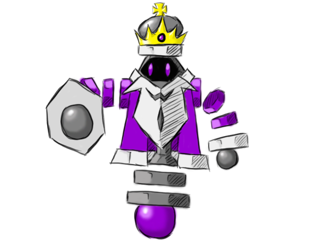
I really like this art, but you should considered that "King" in chess is a slow piece, au contraire, the queen is very speed. If we applicated this to Pokemon, maybe The queen has to be special-faster and The king has to be physical-slow.I followed most of the advice I got, and changed the red to purple, reduced the amount of arm segments and made it more compact. Also, I got rid of the angry eyebrows.

Compare:
and

Unless there are any other suggestions for changes, I WILL CONSIDER THIS MY FINAL SUBMISSION.
Ah, and much thanks to Inhell 13 and cyberzero. Inhell for coming up with the chess concept in the first place and cyberzero for convincing me to combine my previous idea with the chess concept. Also, I agree with Caladbolg~, go with the white one.
I like it, but I wish the crown and the beard could be worked "into" the pokemon a bit better. It looks like he raided a treasure trove before the picture was taken :]I followed most of the advice I got, and changed the red to purple, reduced the amount of arm segments and made it more compact. Also, I got rid of the angry eyebrows.
Compare:
and
Unless there are any other suggestions for changes, I WILL CONSIDER THIS MY FINAL SUBMISSION.
Ah, and much thanks to Inhell 13 and cyberzero. Inhell for coming up with the chess concept in the first place and cyberzero for convincing me to combine my previous idea with the chess concept. Also, I agree with Caladbolg~, go with the white one.
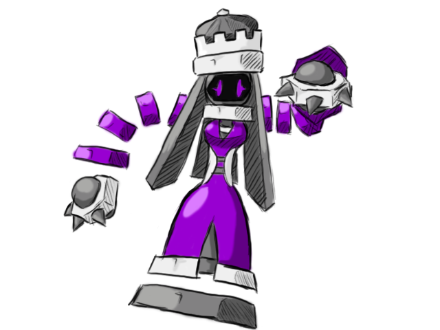
Ah, I've considered that. The main problem is that while the Queen may be speedy, it also takes pieces by charging right into them, exactly like a physical attacker... That said, I do have an alternate work-in-progress Queen piece, but I'm not sure I can get it out in time...I really like this art, but you should considered that "King" in chess is a slow piece, au contraire, the queen is very speed. If we applicated this to Pokemon, maybe The queen has to be special-faster and The king has to be physical-slow.
Hmm, I'll see what I can do about that...I like it, but I wish the crown and the beard could be worked "into" the pokemon a bit better. It looks like he raided a treasure trove before the picture was taken :]
I'm imploring you, find a way to work them in rather than show such a stark contrast between the pokemon and what he's wearing.


I kinda like that idé, because i think it fits them better.what if cyzir's is a dual form, one form male, one female? no difference in stats, just very different sprites? it spices things up a bit, without eliminating a perfectly viable art idea
Aw man, it's the worst thing in the world when that happens! I've had entire projects fall apart because of working for several hours on something, losing it all, and not having the drive to start again the next morning ... =/Blah, I started working on the King's revisions, but I can't go on much further tonight. Stupid Photoshop shut down literally as I was saving the finished Queen, so I had to redo all the work I did... And I have to work early tomorrow.
I actually like the Queen better than the King! It just looks so much more like a Special sweeper.Anyway, I'm still sticking to the King design, but I'd just like to show the Queen's design.[/IMG]


