
Ohhh! That's what I thought when I saw it. xD Also, looks too digimonized with those details. I prefer the InHell13's version.when i see this, all i can think of is kingman from megaman battle network


-
The moderators of this forum can be found in the CAP forum staff directory.
-
Welcome to Smogon! Take a moment to read the Introduction to Smogon for a run-down on everything Smogon, and make sure you take some time to read the global rules.
-
Congrats to the winners of the 2023 Smog Awards!
CAP 5 CAP 5 - Art Submissions
- Thread starter tennisace
- Start date
- Status
- Not open for further replies.


I think it's not actually the details which set the king a bit apart from a pokémon, but rather the design's height. For any pokémon's body structure, one adjective is key: compact. Even Rayquaza and its long body has a stocky feeling to it. Thus, I believe that what the king needs is just a more squat body, and perhaps shorter arms to look perfect. As for the coloring, purple is indeed a good alternative for a "royal" color, Cyzir.
I must say that there are hardly any designs which I don't like in here, and Stegosaurus and Rockstrich are great additions in my opinion. For the latter, I think what I said avobe also applies, but only to the 'main' pose. The other looks shorter and thus better.
I must say that there are hardly any designs which I don't like in here, and Stegosaurus and Rockstrich are great additions in my opinion. For the latter, I think what I said avobe also applies, but only to the 'main' pose. The other looks shorter and thus better.

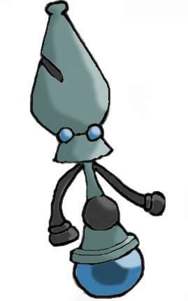
This one has my vote. I believe it fits the criteria perfectly.Here's the one I'd like to submit;


So the next thread will have all of the finalized artwork on a poll where you can vote on multiple? Or are you going to choose the entries for the next?Updated. If I missed your art or I have the wrong version up please PM me, else it won't make the poll.


The Pwning Comet!
Ah, it's good to be back! I've been working on several items, which I guess I'll show off here. Time for my last major submission post to CAP 5!

(Thanks for the name, guys! :P)
First, I'll cut to the chase:

The above photo is my final submission.
So, I decided to go with the watercolor. Hadn't done one in a while, and while it didn't turn out exactly like I wanted, it was better than I expected. Good enough for the ol' CAP, I think!
Anyway, here's my final argument for why you should consider The Pwning Comet as your CAP of choice!
1) It's fast -- This CAP's objective was to Break the Mold, and I think that is a very important point to take into consideration when choosing a design. My comet design is visually sleek and speedy -- you can tell just from looking at it that this thing is going to be zooming.
2) It's Special-oriented -- Housing a geothermal crystalline core for an eye, the comet was made for special attacks. No fists, no legs, no physical weapons -- just an eye that can generate tremendous energy attacks and an aura so powerful it leaves a trail wherever it goes.
3) It's frail -- It may be a rock, but it sure doesn't look terribly sturdy. In keeping in line with the stat spread, the comet has no excess, rock solid bulk to protect it -- in fact, that eye looks like a mighty vulnerable weak spot. He may be able to dish out the pain, but can he take it...?
4) Diverse movepool potential -- As was commented on in previous posts, a comet has incredible potential for a wide variety of special attacks. When considering a design for a special-oriented rock pokemon, keep in mind which ones would not only be capable of but appear natural firing energy balls, ice beams, flame blasts, and more. I think you'll find the Pwning Comet more than suitable for this task.
5) Originality -- He's a friggin' comet. From space. If you want to break the mold and do something different for a rock type, I think this is an excellent option.
6) Pokemon appearance -- As I've demonstrated with my sketches (I hope...), the Pwning Comet fits in easily and naturally with the rest of the pokemon cast. He does not appear out of place, and instead meshes with the overal style and direction of Sugimori's characters.
Keeping this points under consideration, I think you'll find the Pwning Comet a more than attractive prospect. Even if you're not sold on the idea, keep in mind these main points when looking over the candidates, particularly in the fast, special, and frail departments. ;)
------
Now, over the past couple days I've made a few more sketches that I'd like to share with you all, if you don't mind. ;)
First, everybody seemed to be making pics of their pokemon using the move Ancient Power. I thought I'd try my own exaggerated take on the technique, just so I could demonstrate the awesome might of the Pwning Comet. :P
Here was my first attempt, with the Pwning Comet attempting to take down a lone Garchomp:

I felt it to be a little busy, so I added some shading and took out some elements to produce a second version:

That was pretty fun. :)
Next, I wanted another go at demonstrating the Pwning Comet's satellites, as I didn't find the first adequate enough. So, here is my second try at Tri Attack:

Much better, I think.
And since the tradition seems to be to beat up on Blissey, I sketched a quick comic just for fun:

Yes, a Hyper Beam from the Pwning Comet is enough to devastate anyone -- even Blissey! :D
(And while I'm compiling pics of the Pwning Comet vs. Everyone Else, here's the link to the Lucario pic that a lot of people seemed to take a liking to: http://i201.photobucket.com/albums/aa183/LoftyTheMetroid/Comet_Poke_8.jpg?t=1221946247)
And finally, I bought some clay for fun and came up with some... interesting results:


-------
So that's it! I'm done! I'm burnt out! I hope you all enjoyed my stuff and will consider it for CAP 5.
(And if I posted too many pics or added things I shouldn't have, if somebody could let me know, I'd be glad to change it.)
All finalized art.So the next thread will have all of the finalized artwork on a poll where you can vote on multiple? Or are you going to choose the entries for the next?
@Lofty: YES YES YES YES YES YES
Most awesome piece of art. EVER. Especially the Shoop Da Whoop in Blissey. Even more awesome than a Shoop Da Whoopin' Deoxys-A.
Most awesome piece of art. EVER. Especially the Shoop Da Whoop in Blissey. Even more awesome than a Shoop Da Whoopin' Deoxys-A.

I really like the concept and execution of design of the Chess King by Cyzir. It works. The king is better IMO, because it is more vulnerable and would make sense attacking from afar via special attacks because it can't move far enough to get up close. The Queen would seem to be more of a fast Physical attacker. My only complaint is that it does seem a little digimon-esque. I also think you should make it pruple, its a good idea.
And nice job Lofty. The effort you put into your submission is evident; you have an abundance of conceptual work and it adds to the believability and depth of your concept. I commend you and I think this is an exemplary art contribution/submission to the CAP project.
And nice job Lofty. The effort you put into your submission is evident; you have an abundance of conceptual work and it adds to the believability and depth of your concept. I commend you and I think this is an exemplary art contribution/submission to the CAP project.


I like the white one more inhell 13
I don't think that your meteor have Pokemon appearance. Look Solrock, or Lunatone. They're very simples balls with eyes, but they have this "rock mojo". Also Koffing [And your meteor is very similar to Koffing] can show expressions.6) Pokemon appearance -- As I've demonstrated with my sketches (I hope...), the Pwning Comet fits in easily and naturally with the rest of the pokemon cast. He does not appear out of place, and instead meshes with the overal style and direction of Sugimori's characters.
I think, your Art concept have this mistake, like Doug's Art.
@InHell13. Go with the white one.
His mistake is alot more harder to fix since his Meteor Pokemon has only one eye. It already was hard for it to show expression when you have an eye that takes up 50+% of your face aka Magnemite. He could add another eye to fix it, but that would destroy the idea around Meteormon mono-eye of eeriness.I don't think that your meteor have Pokemon appearance. Look Solrock, or Lunatone. They're very simples balls with eyes, but they have this "rock mojo". Also Koffing [And your meteor is very similar to Koffing] can show expressions.
I think, your Art concept have this mistake, like Doug's Art.
Thanks for the positive comments, guys!
But then again, I guess that's your opinion, and you're entitled to it. As for my opinion, I've never seen your bird-statue design show a single emotion beyond "open eye" or "half-open eye", so I don't really see where you're coming from on that point. In fact, it borders on being hypocritical... (Unless you meant the Koffing comparison to say that my comet does demonstrate emotion...?)
And I thought I already addressed this when I posted this (and I'll delete this if it's considered an art bump, as I don't want to break any rules...):

(Also, I must admit that I chuckled a bit at LonelyNess's Power Ranger villain comment...)
I don't mean for any of this to be offensive, I'm just saying I think it would be a little more constructive of you to suggest specific improvements instead of one-shot nitpicks that don't really seem to add anything.
You know, you don't need to make a comment about every single submission. It's one thing if it's constructive criticism, but I've seen you nitpick at about 95% of entries when it's not really necessary. I, personally, don't really mind, but it's just an observation I've made over the course of the thread.I don't think that your meteor have Pokemon appearance. Look Solrock, or Lunatone. They're very simples balls with eyes, but they have this "rock mojo". Also Koffing [And your meteor is very similar to Koffing] can show expressions.
But then again, I guess that's your opinion, and you're entitled to it. As for my opinion, I've never seen your bird-statue design show a single emotion beyond "open eye" or "half-open eye", so I don't really see where you're coming from on that point. In fact, it borders on being hypocritical... (Unless you meant the Koffing comparison to say that my comet does demonstrate emotion...?)
And I thought I already addressed this when I posted this (and I'll delete this if it's considered an art bump, as I don't want to break any rules...):

(Also, I must admit that I chuckled a bit at LonelyNess's Power Ranger villain comment...)
I don't mean for any of this to be offensive, I'm just saying I think it would be a little more constructive of you to suggest specific improvements instead of one-shot nitpicks that don't really seem to add anything.
Are you intending to submit this, or was this post supposed to demonstrate something? Because it doesn't do either.


Well, I certianly can't disagree with that. It's a rock with a big ol' eye in the center -- expression is going to be limited. It comes with the terrirory of making something like this (I would know, I loved drawing single-eye-related stuff when I'm bored).His mistake is alot more harder to fix since his Meteor Pokemon has only one eye. It already was hard for it to show expression when you have an eye that takes up 50+% of your face aka Magnemite. He could add another eye to fix it, but that would destroy the idea around Meteormon mono-eye of eeriness.
Personally, I have a small problem with the meteor, but I'm just going to keep my comments to myself and see how it all pans out before I say anything premature (or anything I might not have seen clearly).


- Status
- Not open for further replies.