CAP 13 CAP 2 - Art Submissions

Status
Not open for further replies.
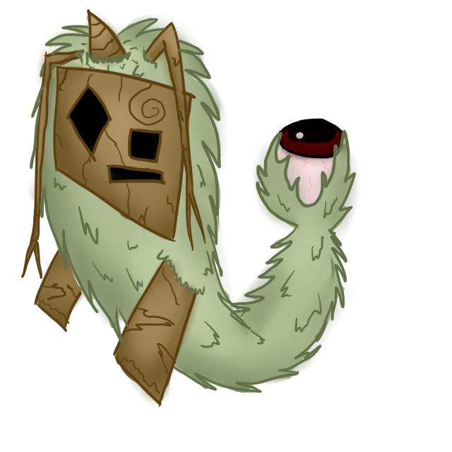
Based on the choices made since my first post I updated my design (the first version can be found on page 7). I reserve the right to repost this design as a final submission, (or label this post final submission, but that seems less appropriate).

Here it is:


Design choices:

A floating design was kind of silly looking back on it, especially now we know its ability is not levitate. The chosen stats have pretty high defenses, but kind of low health, so I figured it would fit if the pokémon was not especially bulky, but rather kind of hard to fully hit, with the flexible ghostly body and the tentacles to fend the attacks off. I did add sort of a wooden mask for a bit more of a bulky look, and because it fits both typings. the tentacles also function as a link to physical (grassy) moves like vine whip. power whip and constrict. furthermore it just felt like it needed at least some sort of appendages. I kept the ponytail sketch brush, because I like the look of it, it's yet another opportunity to show some plant/ectoplasm green. Furthermore I respectfully disagree with those saying sketch is not a (big) part of the design, it's the entire concept we're working from. A cameo appearance is the least I can do for it. We'll figure something out to not make it relearnable. I thought about giving it a mouth too, but for both a plant and a ghost that didn't seem to make too much sense.

On a side note I also removed the mist in the background, I figured that indeed wouldn't count as a plain white background. Also, this non floating variant seems decisively less misty.

Background story:

It is said that when the forest is in trouble the spirits of the forest will manifest themselves in the physical form of a [name], rising up to the challenge of their rivals, finding their weak spot and using their ghostly powers to learn a countering move.
 

paintseagull

pink wingull
is a Top Artistis a Forum Moderator Alumnus
paintseagull: I personally prefer design B. While Design A is pretty cool, it is hard to really see your whole concept in it without the designs on it being as visible. Additionally, the large arms and body make it look really unbalanced, as if it could fall over any minute. Design B I think gets the idea across much better. I would however consider reducing the amount of fur around the legs, as right now its hard to tell if it even has legs under there.
For B, my intention was that, instead of legs, it has a more ghostly grass-like cloak trail (sorry I really can't think of a word for what it's supposed to be! - Doug's willow lady has a dress with a trail similar to what I'm going for) This way it can move around in a more floating/hovering ghost-like way without looking like it needs levitate. And it keeps the stealth element that I wanted. I really didn't like how unbalanced the legs were but I felt like big bulky digitigrade legs that would be needed to balance didn't really work with the more crouched human-like shape I was looking for.
 
For B, my intention was that, instead of legs, it has a more ghostly grass-like cloak trail (sorry I really can't think of a word for what it's supposed to be! - Doug's willow lady has a dress with a trail similar to what I'm going for) This way it can move around in a more floating/hovering ghost-like way without looking like it needs levitate. And it keeps the stealth element that I wanted. I really didn't like how unbalanced the legs were but I felt like big bulky digitigrade legs that would be needed to balance didn't really work with the more crouched human-like shape I was looking for.
I honestly prefer A, but as you say it looks unbalanced. Perhaps you could have it resting one of its hands on the ground, with only one of them raised? Something like that helps the balance issue a lot...plus, that way you can picture it moving like a bear. Usually on four legs, but capable of moving on two for a short period of time.
 
paintseagull: what about mixing both? I personally think that it could be great if it had both legs and a grassy cape (kind of like jolteon's tail) or maybe using B's body sahpe with a "crest" of grass. By the way, both designs are great.
 
paintseagull i really do like both designs, but I personally feel that it should have visible, or at least existent, legs. One thing I like about the design is that through all its ghostliness it retains an element of mammalian normalcy, which makes it feel refreshingly simplistic. It's also probably the only design in this thread that realistically feels like part of the Field egg groupy. Having no legs detracts from this a bit.

I'm kinda inclined to side with A mostly because of this (and partly because it's crazy cute), although the flattened tail one feels more ghoulish.
 
The ability stage has completed as far as it can be done now, with the result No Competitive Ability. That means that all artists should take this post to be their 48 hour warning before the closing of this thread. That means that if you have any remaining design changes to do, or final supporting art to draw, you really need to get it done. I will also be reminding you all in 24 hours of the 24 hour warning, but you probably shouldn't put everything off until then.

Cheers and good luck in these last days!
 

DougJustDoug

Knows the great enthusiasms
is a Site Content Manageris a Top Artistis a Programmeris a Forum Moderatoris a Top CAP Contributoris a Battle Simulator Admin Alumnusis a Smogon Discord Contributor Alumnusis a Top Tiering Contributor Alumnusis an Administrator Alumnus
Moderator
Read this if you do not want your final submission disqualified

Every CAP project we have artists that fail to read or follow the rules for final submissions, and their submissions are disqualified. That means they do not show up in the final poll, and the designs have no chance to get votes or win. You will not be given a chance to fix your design and get into the poll later. Artists get pissed off over this, moderators get into testy arguments, CAP voters get butthurt because their favorite submission is not in the polls -- it is difficult all the way around.

To all artists, please make this easy on everyone, read the OP of this thread very carefully and follow the rules to the letter.

If you have even a sliver of doubt as to whether you are breaking a rule or not -- then you are probably breaking the rule. Don't try to walk the fine line, it will not work out well for you. I can't stress this enough. Every CAP we have artists that think the rules are "general guidelines" and are astounded and offended when they discover their art is disqualified over what they perceive as "a technicality".

Here are the most common rules that get art disqualified:

1) Art size. If you are over or under the size limits by even one pixel, your art will be disqualified. Measure your art before posting it.

2) Backgrounds. Don't post art with a transparent background. The rule is "plain white". Also, don't put shadows on the ground near your pokemon or any other stuff around it. Plain white background means a PLAIN WHITE BACKGROUND.

3) Outlines. This is a ghost type pokemon, so I'm sure this rule will be broken more often than other projects. Don't blur your pokemon's body anywhere to create a "ghosty look" -- you are breaking the outline rule. Don't put a smoky haze around your pokemon -- you are breaking the outline rule. Don't have any glowing body parts -- you are probably breaking the outline rule. Just draw a cartoon with completely unmistakable, unbroken outlines around the entire pokemon. Anything fuzzy, glowy, blurry, smoky, hazy, etc -- it's going to get you disqualified, so stay away from it.​


Those are the three rules that cause most disqualifications, so I'm pointing them out specifically. But I highly suggest you read all the rules carefully and make sure your final submission complies with all of them. Supporting art can contain anything you want, so go nuts with those pics. But your Main Design is going to be scrutinized very carefully with regard to the rules. Don't get caught on the wrong end of it.

If you have questions about compliance with the rules, please DO NOT POST QUESTIONS IN THIS THREAD. Contact an art-savvy CAP staff member (me or Wyverii do the bulk of it) via PM or IRC and get a quick yes or no answer as to whether your art is legal. It is your responsibility to be compliant with the rules. It is not the staff's job to warn you ahead of time. If you want rules advice, then I highly suggest you get your final submission posted ASAP. If you post at the last minute, then ask for advice, and find out your design is illegal right before the thread closes -- do not expect us to keep the thread open for you to go fix your design.

For the record, I have seen MANY designs posted in this thread that are illegal. Read the rules and don't lineskate.
 
Final Submission


Supporting Material
http://i782.photobucket.com/albums/yy101/SentretLover/CAPsketch1.jpg
http://i782.photobucket.com/albums/yy101/SentretLover/CAPsketch2.jpg
http://i782.photobucket.com/albums/yy101/SentretLover/CAPsketch3.jpg
http://i782.photobucket.com/albums/yy101/SentretLover/CAPsketch4.jpg

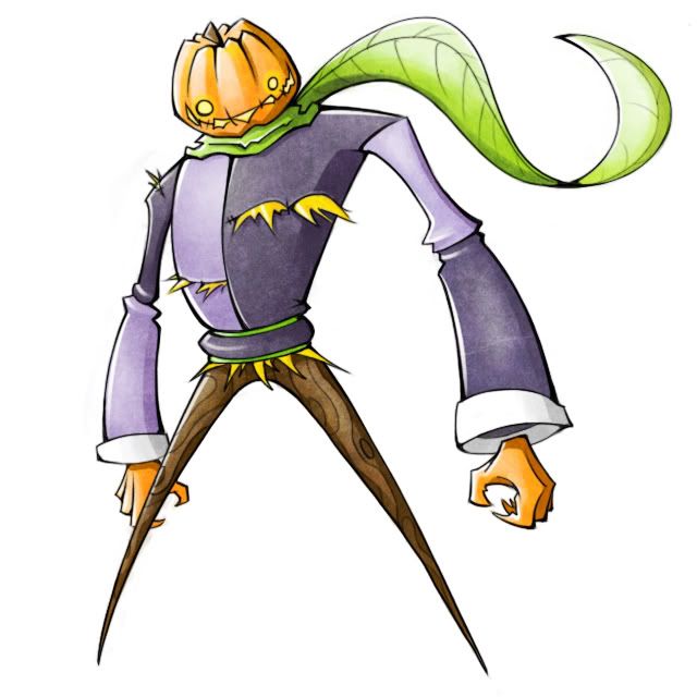
Early on in this CAP I had two ideas, the scarecrow and the ponytail painter. As the CAP progressed, I felt that my ponytail painter was redundant (and worse) than other pixie/feminine mons. *cough* doug's and Ylix's *cough*
So I continued with my very obvious pumpkin idea! As the CAP went on, I saw fewer pumpkin themed submissions so I deemed it my duty to give it my best effort!

This was probably my most indecisive CAP process ever. I had too many directions to go in and not enough time. In the end, I found a compromise that at least I am happy with! The coat is inspired by a harlequin and civil war jacket (thought most of that is gone). I went with two straight legs mostly because one leg looked slow and I felt I could emphasize it's ghost typing without it; wobbly withered legs looked weak.

I feel like, since sketch is an egg move thus not naturally learned, it should be incorporated subtly. In the supporting artwork, you can see how he would go about using sketch in a battle. Basically, he re-carves his pumpkiny head with the symbol that correlates with the move he is sketching.
 

Calad

Hero of the Blue Flames
is an Artist Alumnus
Final Submission

Final Submission

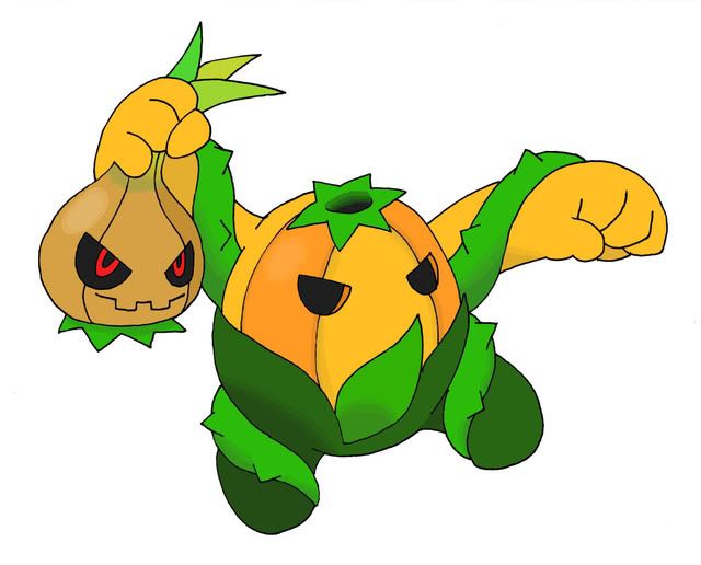
Headless OnionPumpkin


Headless OnionPumpkin's Concept
The OnionPumpkin its based on Headless Horseman of The Legend of Sleepy Hollow. The onion [the head] and the pumpkin [the body] are one. The onion comands with its ghostly powers the rest of the body, and It confuses the enemy separating its head from the body.

Headless OnionPumpkin's Design
The design was made to strongly resemble a "multiple-parts pokemon" like Cherubi, Exeggcute and Exeggutor, all Grass-type pokemon. The grass-theme in the design are the vegetables, one of them easily recognizable as a "Ghost- related Vegetable". The other one it's the mastermind of this creature, and It will make you cry.
The pumpkin its the strong, bulky but clumsy part of the group. The onion is offensive tactician who manipulates everything from the shadows.

Headless OnionPumpkin's Color Scheme
I choose strong colors for a Ghost pokemon to break the mold. I don't want a dark thing to force the "ghost-type".
 
Final submission:


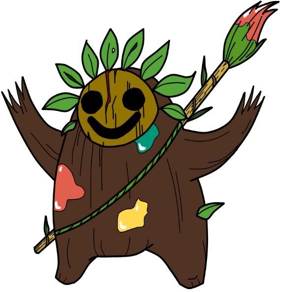
As I don't think I'll be editing it anymore, I choose the wooden ghost bear.


This pokemon was born out of the spirit of an errant and loyal pet. When his master abandoned it in the forest, it became sad and lonely, only wishing to return with its owner. Time passed by, and the man didn't come back for his pet. As it wasn't used to be left out in the cold and dark, it suddenly became souless, dreadful. Its soul binded with nature and its body became like wood. It adopted, though, more human traits: it leart to walk with only two feet and adopted a language based on drawings. Every night, a rainbow painted on a tree is found on that same forest. Some say it's casuality, others say it's the pokemon, whose sad soul still mourns for happiness.
 
Final Submisson

Final Submission


Supporting Material:
http://www.marriland.com/oekakidoodle/pictures/MO_D_112942.png

CaP2 is a forest spirit that helps lost people, who's hearts mean no harm to the forests in which it dwells, find their way out. If CaP2 sesnses a person who wishes to harm the forest, it will give warning with flashing lights from it's lanturn. If the person insists, CaP2 will lead the person far into the forest so they get lost. CaP2 is born with a natural curiosity of other pokemon, and will copy the actions of the first pokemon it finds. The light in it's lanturn is filled with elemental power, allowing CaP2 to succesfully copy any attack it finds.

(lol last year I got disqualified for having Final Submission in the wrong place and i think other reasons. I have no predictions of winning this CaP design, but I want to participate anyways :D)
 
I've come to the realization that I'm just not experienced enough as an artist here for my design to have a chance against the likes of SoIheardyoulikeSENTRET, DougJustDoug, Ylix, etc. I've really just lost interest in working on my entry in vain. :/

Totally voting for SoIheardyoulikeSENTRET, though. Pumpkin-heads FTW! :D
 
Final Submission

Final Submission


Supporting Material

This old Pokemon roams through the forests at night, tricking unsuspecting travellers into the depths of its domains using its illusion abilities. Very wise and intelligent, it claims to know absolutely everything. Its pupils are said to look exactly like a full moon at night.
 
Final Submission


Since there's not much time left, I guess this is the last I'll be updating my design.
Supporting images:
Shiny - http://www.smackjeeves.com/images/uploaded/comics/4/e/4e0863ff9Z6ne.png
Back - http://www.smackjeeves.com/images/uploaded/comics/3/9/39ae029a6lQcx.png
Cloaked - http://www.smackjeeves.com/images/uploaded/comics/c/e/ce3874c3eAcz8.png

Inspiration:
After what he's evolved from, I essentially decided to make his final form mostly based on just a fustercluck of undead material. He's mostly like a certain snake-themed wizard, you may know him, Voldemort or something. Anywhales. Voldemort was mostly dead, and brought back using dark magic (shadow magic? Like, shadow ball or something?), so he's essentially a zombie wizard. Wizard theme also creeps through to the Eggplant Wizard from Kid Icarus, a game about an angel in the underworld, fighting a bunch o' grim reapers. Yeah, dead shit there. We could go further into the angel theme, how he's kind of based on the angels described in some book of the bible, I completely forget which one, but it was probably revelation. Said to have 6 wings, with which they cloaked themselves in - much like how this guy uses his leafy wings to cloak himself in that last supporting artwork. Also somewhat inspired by, and shaped into, Dracula, specifically from Castlevania 3, complete with cloak and staff (which is made from a quill and covered in ink - easily usable for sketch. Say, doesn't his monk-like appearance and angelic inspiration justify his ability to write and draw with that quill, much like how reading and writing was originally meant for only the monks and them people?). And lastly, his butterfly-like appearance, nudeadness, and especially, his hood all are inspired by the "God Tier" from Homestuck, as especially evident in his shiny form (coloured like Vriska's shit - as well, the normal colouration may be inspired by the hero of heart's God Tier outfit?) which is essentially the player killed and brought back to life; for the trolls, whose lifetyle and reproductive process is much like insects, starting out as grubs and hatching from their coccoons, and in the end, their outfits end up gaining wings like a butterfly - referenced in the winglike cape, and the eyespots, which butterflies tend to be famous for.

TL;DR! Quack!


And on another note, I would like to apologize to those who were offended by my comment made earlier. I know it was really rude, and I've been trying really hard lately to stop and think before I say things. I've sure learned my lesson, and I am going to try my best to avoid saying things like that again.
 
Final Submission

The Pokemon is a spirit that takes the form of a panda. It's link to grass is seen in it's bamboo shoots which can be used as rudimentary pens to sketch with. The panda fits the bulky stat spread and embodies a physical attacker with its fairly strong appearance.
 

canno

formerly The Reptile
FINAL SUBMISSION


Originally, I wanted to base the concept around a bush. However, a bush is rather boring on it's own, but it gets the versatility of having branches that can form in multiple different ways (tying into sketch very nicely imo). I wanted to give it a definite shape, so I decided to for-go a narwhal due to the simplicity of a normal narwhals shape. The planks are meant to be it's arms, while the snowman hands are meant to be antennas-styled limbs. The mask, imo, is the best part. It has a nice dead look to it. As for the eye, it has a sinister look to it, and lets me explain how certain moves [assuming it gets these moves, Will-o-Wisp, Solar Beam, ect.] come out of it. Also, it looks rather nice and fits the design.

I changed the original art because I felt that it would be too fuzzy, thus violate the Outline rule. Now it's more leafy, in the same style as Shamin's grass part of it's body.
Support Art (Fire Punch/Hidden Power Electric)
Support Art (Original Fizzy/Furry version)
 
@paintseagull: B is way better ofc, as others have said. Though personally, I think a fusion of B and the one in your last post (back on pg 15 I think) would be best, because that design was really sexy too. Love your work!

@DougJustDoug: That story nearly brought me to tears, and the design is great. I especially love that deep grayish-green you used.
 

Birkal

We have the technology.
is a Top Artistis a Top CAP Contributoris a Top Smogon Media Contributoris a Site Content Manager Alumnusis a Battle Simulator Admin Alumnusis a Senior Staff Member Alumnusis a Community Contributor Alumnus
Final submissions are looking great! I took some of the color requests for my Corn Design and a few of my own and put them into the below spoiler. Which colors to do prefer? Feel free to mix and match color palettes! Also, if you can think of any shiny coloration suggestions, then please say so! Sorry the quality is a little on the short side; I'm simply looking for color and design feedback at this point.


ok i should stop spamming this thread with my pictures

http://i1238.photobucket.com/albums/ff493/EnergyStorm/CAPalt3.png

But either way, here's one last concept that I came up with, it's essentially a "wood sprite" that's extremely diminutive, but can conjure up enormous vines to whack things/block incoming attacks.

For comparison, here is my previous design. Also I just realized that I should probably remove all the glowy, ectoplasmic-y crap. well.

http://i1238.photobucket.com/albums/ff493/EnergyStorm/CAP2alt.png

Comparisons, anyone?
 

Lemonade

WOOPAGGING
is a Site Content Manager Alumnusis a Team Rater Alumnusis a Social Media Contributor Alumnusis an Artist Alumnusis a Forum Moderator Alumnusis a Top Contributor Alumnusis a Smogon Media Contributor Alumnus
Final Submission


Collar and a cloak thing surrounding a red ball that is the source of Sketch. Floating on a lillypad.
 
I figure it may be a bit late to give any proper constructive feedback to those who have finished, so I'll do those who haven't.

Energy Storm While the snake is more interesting, I'd probably prefer the newer one for it's simplicity. Wait to see what others think, though.

The Reptile I can see blurs in some parts. You should fix those or you might be disqualified.

Birkal I think I prefer the first and third colours, myself. I think either the fourth or teas and blues' suggestion would work for a shiny.

paintseagull I personally prefer B. I'd suggest adding something along the neck to show it's really a cape-like body thing, though. Unless flowing straight into the tail was the whole point. The rump would probably slim down a bit or show an obvious curve or something to show it's a cape in my opinion.

gonodactylus The first thing I notice is what the others have noticed - Mr Tornadus. Changing the body and the face will probably clear that up.

Wyverii To be honest I like that pose more than the main one, but still great however. Was the feather for the pen the same as it's hair or paper as well? I don't really have much to say though.

RotationalBasis I don't understand what the point of the television-like helmet is, nor the green t-shirt or for some reason red antennae. The green colour does work though, I just don't really get the point of those features.

Chomz I prefer the first design myself; it is simple and gets across sketch, grass and ghost in a simple and effective manner. The shade of green you chose is quite painful to look at though, maybe it could be toned down a little. It also doesn't look as bulky as it probably should.

BrotherMycroft Wonderfully bizarre choice of colours. The vines that wrap around it's stomach seem awkward though. Maybe they could be rearranged differently?
 
Time for some FLOWER POWER:


And here are some other drawings: http://www.iaza.com/work/111208C/iaza13563530004700.png

It's based on a hippie and all what come with it...
The male version has a beard (even though I might get rid of it...)
and the female version has eyelashes and locks of hair on the front.
I'm not really shure what I should keep the ghosty-smoke under the pokémon...
But i'll think about that later.

Even though there isn't so much time, comments and suggestions are more the appreciated​
 
Final Submission


Support = Dex Entries

ENTRY #1: KITCHENMON has three brains. The parts can function independently, but they mainly work together as one to accomplish tasks.

ENTRY #2: KITCHENMON's knife is incredibly sharp and can deal massive damage to foes. The board can be used as a shield.

ENTRY #3: It cuts up vegetables and other plant matter on its board and flings the resulting bits at enemies to perform a wide variety of moves.

ENTRY #4: This Pokémon is very creative, as it was once a chef and two assistant cooks. However, try as it might to continue to produce fine cuisine in the afterlife, its inability to see is a huge hindrance.

ENTRY #5: KITCHENMON believe that cooking is the highest form of art, and will mercilessly slaughter anyone who believes otherwise.
 
Status
Not open for further replies.

Users Who Are Viewing This Thread (Users: 1, Guests: 0)

Top