
I like the actual choice (deep blue), it's more the balance of colours that seems a tad odd.

-
The moderators of this forum can be found in the CAP forum staff directory.
-
Welcome to Smogon! Take a moment to read the Introduction to Smogon for a run-down on everything Smogon, and make sure you take some time to read the global rules.
-
Congrats to the winners of the 2023 Smog Awards!
CAP 10 CAP 10 - Sprite Submissions
- Thread starter beej
- Start date
- Status
- Not open for further replies.


I agree with others that the narrower eyes on my sprite do look somewhat more feminine, therefore I will swap the genders of my sprites. But, my favorite is still the round eyes -- so I will display that one first in the cutsheet regardless.
I still have not settled on a shiny coloring scheme, but I am continuing to experiment! Here's a cutsheet of a few variations on blue shinies.
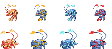
The blue and gold has been posted before, and has been a favorite of mine personally. But, I wanted to try some other lightning colors, just to see what they looked like.
I think the red is just too much, and doesn't go very well together. But it does have a certain aggressive quality to it.
I like the cyan highlights quite a bit, but I think too many people will dismiss it as "LOL, it looks like an Ice pokemon". It's a shame that almost any use of cyan in a design, instantly connotes "Ice" to the public. I don't personally see it that way, but I've seen that to be the case here in CAP.
So, if I go with a blue base color - I think gold will probably be the highlight color I pair with it.


Doug, cyan is awesome!
The back sprite, I'd rather see something inbtween the previous and this one. The last you couldn't see if it had a head. Now i think it looks a little bit too long. Allthough it looks way better now when i look at it then it did before i started to write this post. Maby it'll grow on me. But I'd still like to see something inbetween the 2.
The back sprite, I'd rather see something inbtween the previous and this one. The last you couldn't see if it had a head. Now i think it looks a little bit too long. Allthough it looks way better now when i look at it then it did before i started to write this post. Maby it'll grow on me. But I'd still like to see something inbetween the 2.


shortened the female antennae a little bit.
and also makes the shiny.
i want made a black with blue stripes shiny,but is too used.
some minutes ago, a genial idea sparkles into my mind:
why don't make the inverse of others (read: albino)?
now i'm work on backsprites.
if you want give (constructive) comments,you are welcome!
edit: lol! the normal sprites image's code contains "cap"! isn't funny?

A little work in progress, just to get some opinions on the outline. The main thing that people might not like is the size, which in my opinion is expressive of what it's capable of, not to show it's stature. I just want to hear what everyone thinks.


The claws need to be a bit bigger, otherwise I would vote the hell out of that.
Also, the yellow lines in between each scale on its body run all the way through, while they seem to die out in your sprite. I think it'd be nice if you put them back in, as to give your sprite a lot more colour.
Otherwise, it's my second favourite one so far. Keep up the good work!

Just a note... The color pallets on many of the sprites seem... off.
One thing about Pokemon is that is has a distinct way of doing pallets. The colors are almost universally bright and vibrant, even when the sprites are of dark Pokemon. This being the case, I think people should take note of Chaos's sprite, because it's color pallet is very vibrant. Too many sprites look dark, faded, and choppy because the pallets don't blend and are too dull.
This is just my opinion, thought. Take it as you will. I just don't want some truly great line work to not win because the pallet the spriter chose wasn't "Pokemon" enough.
I don't know how else I could do the stripes, or make the claws bigger on this sprite(not the front one anyway). I guess I still have time to redo the entire thing with the same pose, just done differently. Thanks.The claws need to be a bit bigger, otherwise I would vote the hell out of that.
Also, the yellow lines in between each scale on its body run all the way through, while they seem to die out in your sprite. I think it'd be nice if you put them back in, as to give your sprite a lot more colour.
Otherwise, it's my second favourite one so far. Keep up the good work!


Shiny_togekiss, you have an endearing pose, but I have a couple of things I like to suggest. One of Krilowatt's remarkable features is the noticeable 'kink' it has in its antennae; that sharp angle it takes about 2/5 of the way up from the bottom. I think it would add to your design to lengthen your antennae and add that kink, not only for accuracy but the acute angle would contrast nicely with the soft rounded edges you use. Also, I'd taper and thin its body as you get closer to the tail just to emphasize the shrimp shape. You could maybe even strengthen the 'C' shape on both sides to give it a sort of a 'reverse shrimp' pose, but it's not really that necessary.
Also, Chaoscrippler, I'm digging the mouth, you have such an appealing front sprite! Also, my favorite regular and alt colours so far. Great job.

I've enlarged the front claw, I hadn't noticed it, but it really was proportionally small. Thanks, Sezja.
Also, alto?


Also, Chaoscrippler, I'm digging the mouth, you have such an appealing front sprite! Also, my favorite regular and alt colours so far. Great job.

I've enlarged the front claw, I hadn't noticed it, but it really was proportionally small. Thanks, Sezja.
Also, alto?


Loving the shiny sprites, Cartoons. They're my favorite option I've seen so far.
I messed around with cyan a bit while trying to figure out my own shiny pallet and thought the same exact thing, hahaha. It looks good on your sprites, regardless.I like the cyan highlights quite a bit, but I think too many people will dismiss it as "LOL, it looks like an Ice pokemon". It's a shame that almost any use of cyan in a design, instantly connotes "Ice" to the public. I don't personally see it that way, but I've seen that to be the case here in CAP.
Cartoons, I'm liking the shiny palette.... and I don't really think there's anything else I'd change on yours.
...except that blasted eye on the backsprite. Dx I can't put my finger on exactly what's bugging me so much about it... I think it might be something to do with the placing of the pupil. =___=
...except that blasted eye on the backsprite. Dx I can't put my finger on exactly what's bugging me so much about it... I think it might be something to do with the placing of the pupil. =___=
I don't think that's always the case, but since you happen to be using Cyan here with a blue base, then it becomes all the more likely, you understand. :0 I'd still like to see Cyan with maybe a warmer base color, it could still look neat.I like the cyan highlights quite a bit, but I think too many people will dismiss it as "LOL, it looks like an Ice pokemon". It's a shame that almost any use of cyan in a design, instantly connotes "Ice" to the public. I don't personally see it that way, but I've seen that to be the case here in CAP.

HEY I HAVEN'T POSTED THESE IN A WHILE.
 -->
-->

Re-hashed the face & made some color adjustments. I like it better now. Also, a preliminary beta Shiny, of which there is a 93.4% chance I will not use in the end. When I do change it, I'm probably not going to change the Green, unless only slightly, though the purple color is kinda eh. It's like, a lilac/grape color now, though I'm thinking of making it darker. Originally had an Indigo-ish color, kinda like Cartoons' shinies- which look great on his sprite btw- though I may change it to a more navy/midnight blue.
Terrible shiny colors very loosely inspired by Shiny Wigglytuff.
All colors on the sprite are custom though.
So, any comments & criticism?
Any and all, praising it or bashing it, completely welcome.
I like it, but the neon green isnt as visible as the yellow you had, maybe a little darker. otherwise, thsi sprite nearly makes me want to drop out of the running XD dougs-just dougs too XD and a few others XD


The way I see it, it's a toss-up between Vader, Doug, and Chaos's sprites.
I'd also like to note that I'm really not a big fan of some of these quadrupedal sprites, as they really make CAP look like a weak little shrimp creature instead of a cool Pokemon. I'd much rather it stand up so it can look like it's actually ready to fight. Just my personal opinion.
I'd also like to note that I'm really not a big fan of some of these quadrupedal sprites, as they really make CAP look like a weak little shrimp creature instead of a cool Pokemon. I'd much rather it stand up so it can look like it's actually ready to fight. Just my personal opinion.

@ Chaoscrippler
You're right, making the picers versus claws a gender difference thing is a good idea. The smaller mouth also looks good. Your shiny coloration is also pretty good. My sole gripe is in regards to the back sprites: the antane seem a tad too thick... although I'm not sure if you can thin them out anymore. Reducing the thickness of the antenae should be something to experiment with, I suppose.
@ Doug-Just-Doug
Obviously, the shiny coloration is not as big of a deal as the coloration of the regular sprite. As I have said before, sometimes, shiny colorations on Nintendo's official sprites are nasty.
That said, I can see why you're stressing about the shiny coloration: sometimes, that does have a bearing on whether people vote for your sprites or not. Either the blue and gold shiny or the blue and cyan shiny would be asthetically pleasing. Also, I don't think that anyone would associate the blue and cyan one with "ice-type Pokemon LOL." Either way, pick whichever one you like (or continue to experiment).
@ Cartoons!
You're welcome: I point these things out because I want these sprites to be awesome just as much as you, the artist, do. That claw on the back sprite looks a lot better now.
Also, I like the combination of colors that you're working with the for the shiny. I've always liked the purple / green combo. The fact that you're using shades of each that are unusual makes it all the more interesting.
---
These sprites are really starting to shape up and are looking good. Keep at it!

I fixed up the backsprite so it's not cut off by the left side. Also made female sprites, the yellow marks on the hands and feet are smaller.

I'm not sure if I'm going to stick with the purple/yellow shiny, but I like the blues and lighter purples that others are using.

I'm not sure if I'm going to stick with the purple/yellow shiny, but I like the blues and lighter purples that others are using.

I personally think Cartoons and Chaos have the best sprites so far. I think it has to do with how their sprites simply have more vibrant colours, a more unique feel, and are just generally of higher quality than the rest. I also love the fact that they both incorporated gender difference to make their sprites even more unique. They each bring something completely different to the feel of Krilowatt and I would be happy if either of them won.
However, I prefer Cartoons! by a bit simply because it has that emotionless feel. You really don't know what's capable of, but it still looks like it has something up its sleeves. The colours also seem a bit more lively, for both the normal and shiny colour palletes. I think the problem people have been having with the eyes in the back sprite is that it looks like they're popping out almost a bit too much. At least that's what I'm feeling from it.
Good work everyone, I look forward to the other entries!
So far, my favourite is Chaoscrippler's, however there is one thing that troubles me about the back sprite; it's carapace looks too smooth and flimsy, i think it needs to look a bit more armour-ish, like Cartoons' for example.
I've noticed some people using purple and green as their shiny colour scheme. Purple and green is usually one of the worst colour combinations, and alas, the shrimp is not an exception. In particular, I cannot see green working in the place of yellow on the shrimp. I would strongly recommend a different colour scheme for the shiny (for example, it'd be interesting to see a shiny with yellow as the colour of the main body).

Hmm, I really like the blue/gold combination, Doug, it seems so... Electrifying? Admittedly I didn't notice the "ice-style" when I saw the cyan one, but after you mentioned it I don't think it would be suitable.
I totally agree with you on the red one though. Far too vivid, even if it's an angry shrimp. I'd stick with blue/gold.
I totally agree with you on the red one though. Far too vivid, even if it's an angry shrimp. I'd stick with blue/gold.
DV your sprite is starting to grow on me, buuuut I think that those antenna should be thicker at least on the back sprite. I'd have to see it but i think thick antenna would suit you sprite well.I fixed up the backsprite so it's not cut off by the left side. Also made female sprites, the yellow marks on the hands and feet are smaller.
I'm not sure if I'm going to stick with the purple/yellow shiny, but I like the blues and lighter purples that others are using.
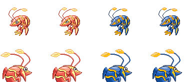
I made some small changes to the front sprite to make them a little sharper and to remove a few inconsistencies. I also tweaked the colors on the blue and gold shiny, to make the blue a little darker and more vivid. Previous versions looked somewhat "washed out".


- Status
- Not open for further replies.