CAP 10 CAP 10 - Sprite Submissions

Status
Not open for further replies.

Front A ---- Front B ---- Front C ---- Front D
@ Chaos Crippler
I prefer Front D, Just because I think a mouth on a shrimp looks odd and because I liked it little pokey claws, whereas pincers make it look more like one of the many pincered pokemon we already have.
I'm major agreement with this.

I still find that the mouth makes it look too jolly and not concentrated on battle. Again, VERY unfitting of a "dark, ruthless, carnivorous deep-sea hunter".

Shrimp have pincers. Why is everyone freaking out that it loses the feel of a shrimp? If anything it's a more accurate depiction of the concept.
It's not so much that, I know shrimps have Pincers-, it's just the way they are drawn. They just seem too "lobsterish"... Whatever that means. And really, it's probably moreso the second reason then the first for me, that makes me hate them. That the original claws just remind me of scythes or daggers, which seems much more fitting, the hunter it is.


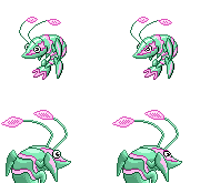
As for my own hideous sprite...
Ugh. I'm terrible at picking out shiny colors.
*Keeps tinkering with it*

Also, the more I look at my sprite, the odder the face keeps looking.
It feels off angle. I think I might edit it a bit, before I post it again...
 

Front A ---- Front B ---- Front C ---- Front D


Because I'm receiving a lot of differing opinions, I'm offering four possible front sprite options. Front A is remains unchanged. However, front B is without the mouth, front C is clawed, and front D is clawed and mouthless.


Likewise, there are two backsprites; one being with pincers and the other clawed. Obviously, the option will correlate with the choice of the front sprite.
I like A and C, the mouth makes this thing more funny for beating Salamence and Gengar. As said on previous posts you should make pincers a gender difference.
 

Front A ---- Front B ---- Front C ---- Front D


Because I'm receiving a lot of differing opinions, I'm offering four possible front sprite options. Front A is remains unchanged. However, front B is without the mouth, front C is clawed, and front D is clawed and mouthless.


Likewise, there are two backsprites; one being with pincers and the other clawed. Obviously, the option will correlate with the choice of the front sprite.


This is exactly my point and deserves to be quoted for emphasis (qft!). Thank you for taking the time to follow up on this issue.


Haha, thanks a lot for the kind words, Doug! I always strive to bring a creative uniqueness towards the original artwork with my sprites, which l hopefully makes them stand out in one way or another. With that said, I prefer your front sprite with the rounder eyes and the second backsprite with the slightly more visible eyes. Also, blue shiny option is the most appealing to me (hence the reason why my shiny sprites will be blue as well, haha.)
i'd go a and c

the back sprites are simple awesome
 
Banny approves of this sprite.

As for the others, I think you're making decent progress... however, I'm really not a fan of the mouth you currently have on yours. :0 Looking at it without it, though, I think it still needs something there... I'd like to see a smaller mouth, or one that's not so wide open or something like that, I think it looks sort of strange with the mouth being stretched as wide open as it currently is.... that's my take on it.

I went back to the drawing board on the backsprite, and redid it completely.

Yes, this is MUCH better. You might perhaps consider making the eye a tad larger on the backsprite, it seems like the eyes on both the front and back sprite are about the same size, ergo, not entirely proportional.

I've gone and made a female Krilowatt. Its tail is heart-shaped which I always thought was a cute distinction previously seen on Pikachu and Heracross.


-- male ----- female --

Also touched up the backsprite. Worked out the dithering, as well as slightly altered the eye, carapace and antennae.
Cute... hahaha. xD Nice touch on the gender separation. I really like your backsprite too, but that eye of his is still bothering me. I'd like to see a little more shading, or centering of the pupil, or SOMETHING to make it look a little more like an eyeball.
 

DougJustDoug

Knows the great enthusiasms
is a Site Content Manageris a Top Artistis a Programmeris a Forum Moderatoris a Top CAP Contributoris a Battle Simulator Admin Alumnusis a Smogon Discord Contributor Alumnusis a Top Tiering Contributor Alumnusis an Administrator Alumnus
Moderator
Here's a cutsheet of the different gender versions of my normal sprites:

After working with the full round eyes on the female sprite, I must admit that I much prefer it to the aggressive male eyes. That's why I put the female first on the cutsheet. I like the cute round eyes so much, that I would eliminate the aggressive eyes completely -- but I need something to connote gender difference, anyway. So, I guess the different eyes are as good as anything. And for people who like their pokemon to look more badass and "battle ready", I guess the male eyes will appeal to those tastes. But, the girl is my definite personal fave.

I also have resurrected a shiny coloring that I previously rejected.

After posting this color scheme on IRC for lulz, several people said they really liked it. I originally thought it was a bit too bold. But I figured I'd post it here and see what everyone thinks.
 
Here's a cutsheet of the different gender versions of my normal sprites:
After working with the full round eyes on the female sprite, I must admit that I much prefer it to the aggressive male eyes. That's why I put the female first on the cutsheet. I like the cute round eyes so much, that I would eliminate the aggressive eyes completely -- but I need something to connote gender difference, anyway. So, I guess the different eyes are as good as anything. And for people who like their pokemon to look more badass and "battle ready", I guess the male eyes will appeal to those tastes. But, the girl is my definite personal fave.

I also have resurrected a shiny coloring that I previously rejected.
After posting this color scheme on IRC for lulz, several people said they really liked it. I originally thought it was a bit too bold. But I figured I'd post it here and see what everyone thinks.
I just think that your shiny colors are too awkward for a strong water pokemon. Perhaps making the stripes and antenna end a red and the skin color a darker blue would work better. Just my opinion though. :)
 
@chaos splicer: Your backsprites are amazing, but your front sprites seem a bit off and different from all other pokemon, just a suggestion but maybe try a completely different pose
 
@chaos splicer: Your backsprites are amazing, but your front sprites seem a bit off and different from all other pokemon, just a suggestion but maybe try a completely different pose
You're telling him not to be creative? Huh? Tell me if I'm wrong.
DougjustDoug@Maybe you could try another color for the bioluminisence light?
 

After posting this color scheme on IRC for lulz, several people said they really liked it. I originally thought it was a bit too bold. But I figured I'd post it here and see what everyone thinks.
You can never go too bold with shiny palettes. xP I like it, looks good.
 
After working with the full round eyes on the female sprite, I must admit that I much prefer it to the aggressive male eyes. That's why I put the female first on the cutsheet. I like the cute round eyes so much, that I would eliminate the aggressive eyes completely -- but I need something to connote gender difference, anyway. So, I guess the different eyes are as good as anything. And for people who like their pokemon to look more badass and "battle ready", I guess the male eyes will appeal to those tastes. But, the girl is my definite personal fave.
The sharper look seems more suited to the female, in my opinion, they look more feminine.
 
Doug, those colors are decent, and I wouldn't mind seeing it, but out of the total four shiny palettes you have, it's the worst. Not that the worst is horrible. It's just...too bright, and the contrast between the two colors on it is just...weird. I can't describe it.
 
I've gone and made a female Krilowatt. Its tail is heart-shaped which I always thought was a cute distinction previously seen on Pikachu and Heracross.


-- male ----- female --

Also touched up the backsprite. Worked out the dithering, as well as slightly altered the eye, carapace and antennae.

Perfect. Really. Best backsprite here, and the front sprites are impeccable. And I think the gender distinction is a great idea, and really works out neat here. Keep up the good work! Also: the backsprite's eye looks vastly improved.
 
At first, I wasn't totally into the pincers, but then I got into thinking, hey, that'd be a pretty rad way to marry the concept with the really cool pistol shrimp.
Darn it Cartoons, why do we have to share a brain? I was gonna say that!
Anyway:
Chaoscrippler: I like Sprite A and Sprite C, but considering how many people are complaining about it, You should make the pincer a gender difference.
Overall great sprites, let's see some shinnies!

DougJustDoug: Awesome sprites Doug, but the Purple and Green shiny color scheme doesn't look very appealing on Krilowatt. For a potential purple shiny, I'd recommend Dark Purple for the body, and Light Blue for the stripes, patterns, antenna ect.


Alright, so the majority preferred options A and C. I took the advice mentioned by a couple of you and will use the pincer and claw sprites as the gender difference, the male having pincers and the female having claws. Also, I made the mouth smaller as suggested and chose a new, more "shrimp-like" color pallet for the non-shiny sprites. Whew...

At first, I wasn't totally into the pincers, but then I got into thinking, hey, that'd be a pretty rad way to marry the concept with the really cool pistol shrimp.
Hehe, that was my intention.
 
I made a backsprite.
Backsprites I'm pretty sure aren't allowed to go over the left side (I'm sorry i'ts like 11 at night and I don't know how to put this better) like how it currently is. I may be wrong but i dont think so? It's a good pose but a little too big for my tastes anyways, so probably just shrinking it a little bit would be the best thing to do.

Collectively I love your sprites though.
 
ChaosCrippler, I think the color schemes are a bit saturated and could use to be slightly lighter. They're very deep in the color that you chose, and in some cases, especially the shiny sprites, the deep colors obscure and blur together the other details of the sprites. Other than this, though, I dig the end result.
 
I like how you changed the mouth, though it looks kinda... ...Weird? The Triangular shape is a kinda awkward.
Perhaps maybe a circular one? If you don't quite know what I mean... Er... Well, kinda like the middle head on Cyclohm.

Also, I still think you need to darken the Lightning Bolt color on his face.
It's WAY too bright. Still looks a bit like a highlight rather than a pattern.


Alright, so the majority preferred options A and C. I took the advice mentioned by a couple of you and will use the pincer and claw sprites as the gender difference, the male having pincers and the female having claws. Also, I made the mouth smaller as suggested and chose a new, more "shrimp-like" color pallet for the non-shiny sprites. Whew...


Hehe, that was my intention.
Your sprites are always an instant favorite. They just seem to fit the design so well and they seem too be very pokemon-y

Cartoons has also captured my eye. Very original, yet still have that authentic feel.

I'll try my hand at spriting this tomorrow (maybe) but I'm certainly not going to vote for myself.
 
Chaoscrippler, can you make the shinies every so slightly lighter, colourwise? Although, maybe lighter isn't what I'm looking for. More contrast between light and dark shades, perhaps?

The new mouth is awesome, though.
 

Skymin_Flower

It's Seed Flare time.


Alright, so the majority preferred options A and C. I took the advice mentioned by a couple of you and will use the pincer and claw sprites as the gender difference, the male having pincers and the female having claws. Also, I made the mouth smaller as suggested and chose a new, more "shrimp-like" color pallet for the non-shiny sprites. Whew...

I love your sprites but, not a fan of the shiny.. XD I just don't like the colour scheme. And unlike other people, i thought the original mouth was fine. But if you want it to be smaller, I would suggest rounding it out because at the moment it looks a little bit awkward.
 
Well, I redid some of the shading, and changed the antennae and made the eyes more googly. My second rendition:


If somebody could help with the colour of the antennae, that would be good. I know they're not perfect.
 
Chaoscrippler is definately my favourite here, by far. The sprite is executed well, it looks polished and the pincers are really great. The shiny colors seem good to my eye, but if majority is for changing them, then you should go with their appeal.
 
Status
Not open for further replies.

Users Who Are Viewing This Thread (Users: 1, Guests: 0)

Top