The Alakazam idea is just plain awesome ._.

-
Welcome to Smeargle's Studio! Please be sure to review the studio rules. Feel also free to check out our hub to learn more about this place!Welcome to Smogon! Take a moment to read the Introduction to Smogon for a run-down on everything Smogon, and make sure you take some time to read the global rules.Congrats to the winners of the 2023 Smog Awards!
The Smog needs your help!
- Thread starter TAY
- Start date
The only thing I dont like about this one is that it looks sort of Halloweenish.
Not a fan of 1950s horror movies?The only thing I dont like about this one is that it looks sort of Halloweenish. I think I may be trying a bit too much.

Here's an amalgamation of three 'Koffing' designs (as in, with Koffing as the 'O'). The purple one is the classic Koffing colour, and also complimentary with Alakazam's yellow. The gold one matches Alakazam, and the Silver one is metallically complimentary.
Alternatively, for those of you who only like my design because there's no Koffing in it:

Added a pipe, and naturally, I had to put smoke coming from it, which matches the 'smoggy' look that most people want to uphold.
I don't know why my computer is blurring all these images, but it doesn't really matter; these are still in the concept stage.I personally love the Alakazam idea, although an idea is that you could use someone else's design for the "The Smog bit" and have the Alakazam at the side.How's this?
I know it's REALLY rough, but I plan to ink (meaning no sketch lines) and color it if people like it. (obviously the torkoal needs fixing, but I'm just curious on people's idea about the concept)You might want to make "SMOG" more legible and less squashed-up.
Better?

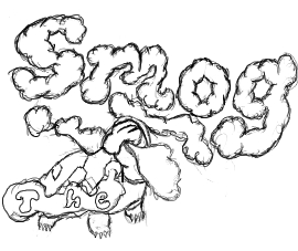
@ tennis: I like the idea of using Torkoal's smokescreen as the title, the Smog letters look really nice. But I'm a bit iffy on the letters of "the". I dunno, it's too plain and tiny. It's a bit too low from the "Smog", maybe move it up higher?
I also don't know why so many people like the Alakazam concept. I dislike it for some reason...Firestorm's is simple and professional. I quite like it. There's just something with the coloring of the Koffing that seems a little... off.
I'll be honest, I'm not a huge fan of the more gaudy looking ones. Something sleek and professional is the best way to go. It just presents itself better.
It's that time of day again.

I removed the fog, since I'm now trying to make the letters (and still Alakazam) better. I changed the font, and added a more detailed newspaper (as per request - I think it looks bad next to the cartoony style of the rest of the drawing.
That's an idea. Anyone willing to lend me a design?I personally love the Alakazam idea, although an idea is that you could use someone else's design for the "The Smog bit" and have the Alakazam at the side.
Agreed. In fact, one of the criteria for a good logo would have to be that "The Smog" has to be visible in its entirity.The problem with the alakazam logo is that people who don't already know what it's supposed to say probably won't know what it says.
Lol, funny. The arms made me laugh. But I think the title should be more bigger and visible.A little bit late but:

I don't know if I will be able to color it though, with my schedule booked as it is.
Prototype, I decided to use the most used pokemon for each letter, except O, in which both pokemon are UU, and Gengar, because I don't know how I'd make gengar into a G =/
Whoa that's awesome. But the Scizor looks kinda weird in that type of pose.
Prototype, I decided to use the most used pokemon for each letter, except O, in which both pokemon are UU, and Gengar, because I don't know how I'd make gengar into a G =/
EDIT: The only problem with this is that most newcomers will think it's just random pokemon lined up in a row with weird poses and a random "the" at the top.I vote atyroki, but it needs some smog. lolKoffing'll get right on that
Actually, Scizor's the only one that's really in a "weird" pose, Metagross just kind naturally looks like an M, Koffing is just a ball with lumps and gyarados has done very similar poses to that in sprites, but I see what you mean, though I could probably make the letters more defined =/Whoa that's awesome. But the Scizor looks kinda weird in that type of pose.
EDIT: The only problem with this is that most newcomers will think it's just random pokemon lined up in a row with weird poses and a random "the" at the top.
Are we allowed to ask for help with editing our designs from others? I don't have any image editing software of any kind (barring MSPaint, and trying to do the thing properly on MSPaint isn't working for me.
GIMP is a free image manipulation program with much more in the way of options than MS Paint.Are we allowed to ask for help with editing our designs from others? I don't have any image editing software of any kind (barring MSPaint, and trying to do the thing properly on MSPaint isn't working for me.
I tried that before, but my computer keeps deleting it for being unstable, or something, whenever I try to download it :(.GIMP is a free image manipulation program with much more in the way of options than MS Paint.Users Who Are Viewing This Thread (Users: 1, Guests: 0)
- ... and 1 more.