
-
The moderators of this forum can be found in the CAP forum staff directory.
-
Welcome to Smogon! Take a moment to read the Introduction to Smogon for a run-down on everything Smogon, and make sure you take some time to read the global rules.
-
Congrats to the winners of the 2023 Smog Awards!
CAP 8 CAP 8 - Art Submissions
- Thread starter CyzirVisheen
- Start date
- Status
- Not open for further replies.

wow, there are lots of good ones. My favourites are still Atyroki, Cyzir, KoA, Doug, and Regi DS though.
@Regi DS: Yours sort of reminds me of Tyranitar, which I think is badass!
@Regi DS: Yours sort of reminds me of Tyranitar, which I think is badass!

Final Submission:
Supporting Material:
Friction Frilldora:
Original Version Colored: http://i731.photobucket.com/albums/ww313/AzulVenatus/i man what do you man/Picture1.png
More supporting material will be added later when I have time.

Supporting Material:
Friction Frilldora:
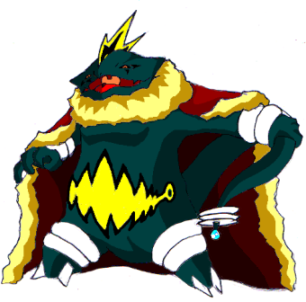
Original Version Black and White: http://i731.photobucket.com/albums/ww313/AzulVenatus/i%20man%20what%20do%20you%20man/Picture-2.pngDesign is simple, an on two Frilladora with a "Royal Cape". The cape is made out of (those wool used in Science classes for friction, and to demonstrate electron and proton attraction). The wool itself protects the fakemon from getting sick. It repels any floating substances that can make the fakemon sick(Shield Dust). The end of its tail is where it can discharge electricity when there's too much friction in the wool of its cape caused from several contacts and attacks(Like a taser). The rings on its arms and foot are Tesla Coils.
Original Version Colored: http://i731.photobucket.com/albums/ww313/AzulVenatus/i man what do you man/Picture1.png
More supporting material will be added later when I have time.
Final Submission
Well, since nobody bothered to offer their opinions, I just decided to go with my second drawing. (Must...restrain...loathing...)
Supporting Material:
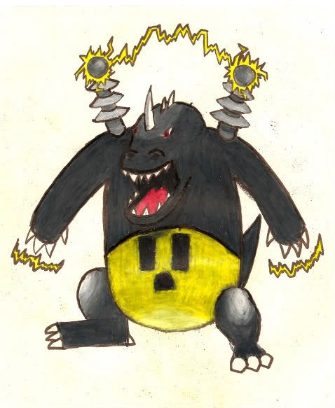
Description: This Pokemon is very sturdy and can take a few hits. It draws its electrical power from the volt towers on its back. The towers send electricity through its body, which it can discharge through its hands. If it ever runs out of electricity, it can siphon it from any electrical source through its hands. It is believed to have originally been manmade, but no one can confirm this.
Well, since nobody bothered to offer their opinions, I just decided to go with my second drawing. (Must...restrain...loathing...)

Supporting Material:
Description: This Pokemon is very sturdy and can take a few hits. It draws its electrical power from the volt towers on its back. The towers send electricity through its body, which it can discharge through its hands. If it ever runs out of electricity, it can siphon it from any electrical source through its hands. It is believed to have originally been manmade, but no one can confirm this.
Final Submission
Final Submission:

This majestic Pokemon is rarely seen, and can drop wicked thunderbolts, start meteor showers, and survive ground attacks from Tyranitars.
Final Submission:

This majestic Pokemon is rarely seen, and can drop wicked thunderbolts, start meteor showers, and survive ground attacks from Tyranitars.

But of course, I'm curious to see how you plan on implementing it.Damn, its goint to be hard to choose between those 2, anyways, KoA, can I please use the 1430x966 image? I will, of course, give you the credit for it
GK, I apologize for not getting to coloring your design, I didn;t intend on my piece to take so long. ;o
I'm also tossing some love Blu's way. It's got a sweet Ganon-ish look to it that puts it in the same boat as Catoons!, imo.

No problem KoA, the work you did for your submission is awesome and the lightning in it is just fantastic and just the fact that it's a pokemon fighting a digimon gives me those cliche laughs.
@ Keishinkae: That looks fantastic, I'm really glad you combined the two and brought back the egyptian look and it looks like a lot of others are glad you did it too. Also, changing the legs from white to black was a really good idea, it's subtle but it really makes a difference.
@ Wyverii: That looks sooo good, and you had the design out so early too. I guess that's how you can tell a real veteran. My only suggestion would be to add that back view you did awhile back in to your supporting art, unless you're working on a new one of course.
@ Blu: That design really came along, and in such short time too. I just wanted to say the change on the stomach to a more electric design from the ones that looked like teeth (were they teeth?) was a great idea and the new mohawk looks great too. I also have to agree with KoA in that you've got a great ganon-ish look going. Although, I would advise doing a last minute clean-up by filling in some of those white spots in between the colour and the lines though. You can just edit the post with the new picture when your done, as long as it's within the time limit.
@ AuraStUrm: It's a good thing you coloured it as it won't give people that blastoise feeling anymore. Also, the light socket stomach was a great idea, something in me really wants to see someone use that as a face for their submission.
So basically, there have been soo many great contributions for this CaP that choosing who you're going to vote for is going to be really hard and no one can be mad at losing because the submission that wins is garunteed to be excellent at this point.
Thanks for the inputs!
Anyways, the teeth design in the stomach in the original version was changed to a complex teeth+electric design. I just thought that the "thunder" sign was used too often, which is why I came up with one on my own. Regarding the white stuff, scanning drawings then coloring it in Paint was way too time consuming. So, I kind of slacked off a bit, but if it's an issue with my art, I'll find the time to fix it sometime. @_@
Anyways, the teeth design in the stomach in the original version was changed to a complex teeth+electric design. I just thought that the "thunder" sign was used too often, which is why I came up with one on my own. Regarding the white stuff, scanning drawings then coloring it in Paint was way too time consuming. So, I kind of slacked off a bit, but if it's an issue with my art, I'll find the time to fix it sometime. @_@
Ehn, it's not that huge of an issue, but I could do it for you if you give me permission. It would only take me about five minutes...Thanks for the inputs!
Anyways, the teeth design in the stomach in the original version was changed to a complex teeth+electric design. I just thought that the "thunder" sign was used too often, which is why I came up with one on my own. Regarding the white stuff, scanning drawings then coloring it in Paint was way too time consuming. So, I kind of slacked off a bit, but if it's an issue with my art, I'll find the time to fix it sometime. @_@


I tweaked the shading just a little and changed the eye slightly.

I've got a quick sketch of a supporting pic, but I may not get it completed before final submissions are due.
I'm floored by the quality of submissions in this CAP. Every CAP project, I say "This is the best CAP art field ever!" and CAP 8 is no exception. Although I've grown pretty fond of my electric dragon design, there are several other designs in this thread that I would love to see win it too.

here's a design i did. i know the instrument theme has already been touched upon, but i sort of couldn't help myself:

cartoons, your design is brilliant as usual. another one that works really well is pkmn-taicho321's. great stuff.

cartoons, your design is brilliant as usual. another one that works really well is pkmn-taicho321's. great stuff.


Oh wow, Zant. That's incredible. I think it may be a bit too detailed for a Pokemon, but it's a very very nice design.


Well I worked some more and I'm quite happy with my color choices. I went with the green because with the shading and highlighting it really looks like a circuit board. I'm also posting Electric blue because I have a soft spot for that one and it could be a potential shiny color. So this is close to final submission status.

Link to the electric blue color scheme
I was always polarized with the whole electric dragon concept and I was fleshing out my other concept, the Raijin Dragon, here's some more finalized lineart. I like this too >.<, so I was wondering, are we only limited to one final submission concept? These two are very different though.
http://i44.tinypic.com/2i9s1t3.jpg

Koa, ive honestly hated your stupid dragon from the start. But the end product looks very good. Well done!
zant thats amazing
zant thats amazing


Wow, where have you been? This is an AMAZING design. It's really got a really creative concept to it and you've pulled it off flawlessly.here's a design i did. i know the instrument theme has already been touched upon, but i sort of couldn't help myself:
cartoons, your design is brilliant as usual. another one that works really well is pkmn-taicho321's. great stuff.
Great Job.

Doug your design is amazing, please try to get it ready before the final submissions are due.I tweaked the shading just a little and changed the eye slightly.
I've got a quick sketch of a supporting pic, but I may not get it completed before final submissions are due.
I'm floored by the quality of submissions in this CAP. Every CAP project, I say "This is the best CAP art field ever!" and CAP 8 is no exception. Although I've grown pretty fond of my electric dragon design, there are several other designs in this thread that I would love to see win it too.
Lol I honestly have no idea how to take that. ._.Koa, ive honestly hated your stupid dragon from the start. But the end product looks very good. Well done!
I will just take the compliment though.

Yeah... that's a really wierd comment >>
Great job man
The hell? Out of nowhere you come in with a top contender, seriously ._.here's a design i did. i know the instrument theme has already been touched upon, but i sort of couldn't help myself:
cartoons, your design is brilliant as usual. another one that works really well is pkmn-taicho321's. great stuff.
Great job man

Geez, way to come entirely out of left field with this one, lol. But seriously, this is a REALLY nice design. Very creative.here's a design i did. i know the instrument theme has already been touched upon, but i sort of couldn't help myself:
cartoons, your design is brilliant as usual. another one that works really well is pkmn-taicho321's. great stuff.

...!! And I thought I'd seen all the good ones, but then this friggin' AMAZING one comes outta the blue?!! I love it! Sorry, Wyverii, but this one's gotcha beat! :P I love the concept and I don't know how you made the wings and stuff look so... perfect... If that Pokemon was real, he'd be the only one on my team, he's just that awesome! (ok, probably not, but he'd be first into battle, that's for sure! :P)here's a design i did. i know the instrument theme has already been touched upon, but i sort of couldn't help myself:
cartoons, your design is brilliant as usual. another one that works really well is pkmn-taicho321's. great stuff.


- Status
- Not open for further replies.