CAP 5 CAP 5 - Art Submissions

Status
Not open for further replies.
When is this over? If someone answered me last time, you don't need to tell me again because I'm going to go back through the thread and look.

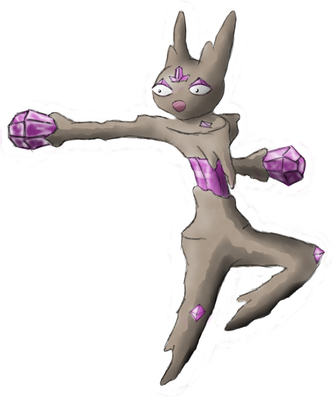
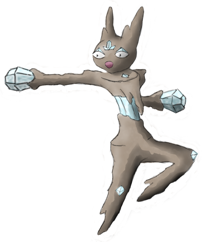
Okay so (although it doesn't seem like anyone cares) I finally got a sketch of what my final submission will look like. Mind you this is again on line paper, but I much happier with this design than the previous ones, it looks more like what I was trying to do. I'll clean this up and color it if the thread doesn't close by the time I get to it.


Edit: posted a thumbnail because the image was a little big...
 
definitely having A LOT of trouble choosing right now. I love Doug's Planet design, but the Easter Island design is awesome. I also really like the "rock eeveelution". gah, this is difficult, but i think my favorite is the planet.
 
With these "Godhan" Hands it looks more phisical than the first one. Also, it seems too bulky for me, and doesn't have any expression.
I don't think it's the hands, I think it's that I made one of them into a fist :S

and I didn't design the main part, so blame beej (I drew it though) :S
 
No..I like it a bit more then before. The only thing I would say is move those two gray stones further down to give it "feet".

Castmat~ That looks great. Not much I could about it except maybe a different expression D:
Heh it does seem kind of happy doesn't it? Well, either happy or yelling. I personally like the expression it's cute but I'm curious as to what kind of espression you would give it. Also I am not sure what colors to give it... the old color scheme that was dark brown rock with purple crystals (and random parts with gold that I am not including) doesn't seem like it will work
and so I am considering a geodude gray color for the rock and blueish crystals like cartoon diamonds. But I don't know. Help?

PS: Thanks for being the only(?) one to give me feedback throughout this thread.

PPS: Castmat is infinitely harder to pronounce than CasMat.
 
I don't think it's the hands, I think it's that I made one of them into a fist :S

and I didn't design the main part, so blame beej (I drew it though) :S
Do what Cartoons did with Fidgit and position the hands together in a meditative state to imply more special than physical powers? :{D

Also, NinjaSquirtle, you chose Amethyst too... XD
 
@UberMunch: thanks for your nice comments!

Now, I've listened to the remarks about my clock's eye being reminiscent of Unown, so I took note, and made some tiny modifications. now the long hand is separated from the eyelid, and I modified the latter to give the eye a slightly angrier expression. Perhaps the similarity is still there, but at least it is less noticeable in my opinion. With that, this may be the final version of my submission:

 
@UberMunch: thanks for your nice comments!

Now, I've listened to the remarks about my clock's eye being reminiscent of Unown, so I took note, and made some tiny modifications. now the long hand is separated from the eyelid, and I modified the latter to give the eye a slightly angrier expression. Perhaps the similarity is still there, but at least it is less noticeable in my opinion. With that, this is the final version of my submission:


When I said that, I didn't necessarily mean that in a bad way. Also, the reason it reminded me of Unown was because of the singular eye surrounded by a big black circle. (Again saying it's not a bad thing, I still do like your design very much)

If I could catch this in-game I'd totally name it "Raep Tiem" :D
 
Heh it does seem kind of happy doesn't it? Well, either happy or yelling. I personally like the expression it's cute but I'm curious as to what kind of expression you would give it.
I was thinking of more of a femme fatale expression. You know, that expression Roserade gives in it's official artwork. I keep thinking that it needs a more female touch to it's body, like actual humaniod curves lol. At the moment it still looks great, but that's how I feel.

Also I am not sure what colors to give it... the old color scheme that was dark brown rock with purple crystals (and random parts with gold that I am not including) doesn't seem like it will work
and so I am considering a geodude gray color for the rock and blueish crystals like cartoon diamonds. But I don't know. Help?
Or you could color the main body simliar to a Red Jasper and have those crystal "hands" Jet. Never good with color suggestions but I like it myself.

More gemstone ideas
 
Getting up tomorrow is going to suuuuck...


I was on a roll and had to finish... I did this drawing a different way than I usually do these kinds of things, but I had to do it this way or else it wouldn't have looked rocky... I'll probably do my drawings like this one from now on. Two colors are there because I couldn't decide, but since this is my (out of date submission), I'll say the light blue crystals are the "shiny" color, I guess, with the purple being the main one.

Edit: No longer final
 
Why does it have a nipple strapped to its chest? "RockSpecialMon has always dreamed of being human, namely the small pleasures it could get from breastfeeding its young" :P

I like the design, I just can't get over that....

Also, I really like a load of these submissions, seems one of the most varied and creative CaP yet. I love caladbolg's and antarctros' from these past few pages, and I think I'm going to be happy whoever wins :)
 
Wow there are a load of talented people posting in here.

I seem to be siding with popular opinion here, but yourDeadGrandad and Caladbolg~ have done the best submissions imo. That evee looking one is good, but it's too similar too many other pokemon. Also I really liked that crazy drum one from a few pages back that everyone seemed to ignore.

Whatever happens it's going to be a very tough decision getting the final art work.
 
yourdeadgrandad, Caladblog, DJD, and Vividsketch have the best so far imo.

The others are good, but dont seem mono-Rock, special enough, or just look to much like other pokes (ex. Rockeon, it just has the look at first glance of an eeveelution. I think that this would distract from the point that it is not an eeveelution, especially after looking at it for a little while).
 
The sphinx design is incredible, probably the most intriguing thing to come up with. It provides a reasoning for the type, the stat bias and gives a base for dex entry and future moveset ideas. I love it.
 
OK, then; since I misinterpreted the Unown comments, I'll get back to the previous version as intended, but keeping the 'angry' eye. Now this is my final submission.


Hey Hey Hey Hey! Don't go forgetting about me now!

Since it's going to take longer than I thought to color it well, I'll leave a teaser here of the lineart:


That enough of an action pose on the right for you guys, or do I need to draw a third? XD

Also, any resemblances between my Rockstrich and a Chocobo are purely coincidental. A Chocobo pokemon was NOT my intention; I had all but forgotten about them until someone pointed out to me that my drawing looked a lot like one...


Just got him colored. I'm debating if I should take off the cymbals :/
I wish more people would have noticed him. I mean, It looks awesome! It definetly looks Rock, and it has a musical theme to it, which conveys special. And he looks like he's cruisin' in this picture, so he could go fast. I think this is awesome because of the quirkyness and charm.
 
Nope, there's still ~2 stat spread polls to do.
This is very good. Because I'm finishing up my er... "rock chocobo" as fast as I can, and I want as much time as I can get for people to view it before they need to decide for or against it in a poll. Even if it's 1 1/2 days, it's still something right?
 
Status
Not open for further replies.

Users Who Are Viewing This Thread (Users: 1, Guests: 0)

Top