


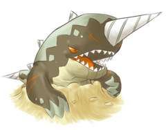
Since we still have a while before the competitive stuff wraps up, and since the activity level in this thread is waning -- I decided to revisit my first sprite pose, and see if I could improve it a bit. Here's an update to my "angry version" of Colossoil:

This sprite was inspired by the pose Cyzir used in his original design for Colossoil. For those of you that may have forgotten what that looks like, here's a scaled down reminder:
I went back to Cyzir's design to try and fix some of the things I didn't like about my sprite the first time around. If you don't remember what my sprite used to look like, here's the version I wasn't too happy with:
Old Version -->

I didn't really like that sprite, because it was just too blocky in the head. Combined with the fact that Colossoil has 95 base speed, I felt like a faster-looking shape and pose was warranted. Hence, my "leaping sprite" that I've been posting over the past several days.
Anyway, I still think this angry sprite has some merits, and I think my update at the top of this post is an improvement to it. I'm still not sure I like this better than the leaping pose -- but it is certainly closer to Cyzir's design and vision, IMO. Not that we spriters are bound to Cyzir's exact pose or anything... I'm just saying...
So, for any of you CAP spriting fanatics that are still hanging around in this thread -- I'm curious to hear your opinions, if you have any.
This sprite was inspired by the pose Cyzir used in his original design for Colossoil. For those of you that may have forgotten what that looks like, here's a scaled down reminder:

I went back to Cyzir's design to try and fix some of the things I didn't like about my sprite the first time around. If you don't remember what my sprite used to look like, here's the version I wasn't too happy with:
Old Version -->
I didn't really like that sprite, because it was just too blocky in the head. Combined with the fact that Colossoil has 95 base speed, I felt like a faster-looking shape and pose was warranted. Hence, my "leaping sprite" that I've been posting over the past several days.
Anyway, I still think this angry sprite has some merits, and I think my update at the top of this post is an improvement to it. I'm still not sure I like this better than the leaping pose -- but it is certainly closer to Cyzir's design and vision, IMO. Not that we spriters are bound to Cyzir's exact pose or anything... I'm just saying...
So, for any of you CAP spriting fanatics that are still hanging around in this thread -- I'm curious to hear your opinions, if you have any.


