
Very much like where this is going. I'm also very glad you trimmed down some of the ornamental stuff--it really helps fit this in with how I understand Pokémon style. Only major criticism I have is for the face; it seems almost...frog-like instead of canine, which I don't much care for. However, other than that, I'm exceptionally pleased and have no doubt this will make it to the polls. :D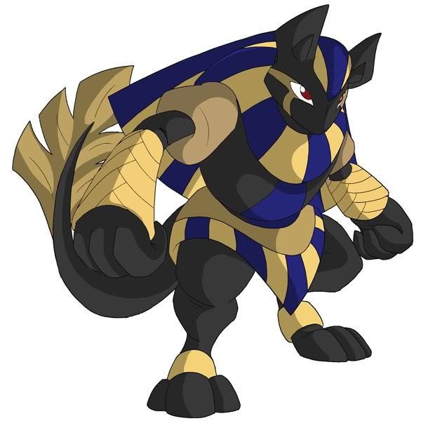
I did up my previous Anubismon design due to feedback and the type of stat spreads being submitted. C&C, anyone?

-
The moderators of this forum can be found in the CAP forum staff directory.
-
Welcome to Smogon! Take a moment to read the Introduction to Smogon for a run-down on everything Smogon, and make sure you take some time to read the global rules.
-
Congrats to the winners of the 2023 Smog Awards!
CAP 9 CAP 9 - Art Submissions
- Thread starter Plus
- Start date
- Status
- Not open for further replies.


Further praises for Chomzloh's submission right here. I just... really like this guy. He seems to have the perfect build for the stat spreads being submitted, and is a good fit for the Auto-Magic Coat ability (which looks like it's going to win the vote). While the design is relatively complicated, it's not too overwhelming and certainly sprite-able.
If there is one thing I do not like, it's the fact that Revenankh is an Egyptian based Pokemon already. I'm not sure if it's fair for the chosen design to be influenced by existing CAPs, though.
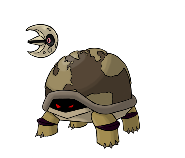
I'm also really liking Chet Rippo's world tortoise. Not sure about the Lunatone, but if worst comes to worst you can just include that in the concept art.
If there is one thing I do not like, it's the fact that Revenankh is an Egyptian based Pokemon already. I'm not sure if it's fair for the chosen design to be influenced by existing CAPs, though.
I'm also really liking Chet Rippo's world tortoise. Not sure about the Lunatone, but if worst comes to worst you can just include that in the concept art.


i didnt see this design before. I really like the whole moon revolving around him thing. fits the typing pretty well too. Kinda reminds me of Shelgon thoughFinal Submission:
Since no one really found anything wrong with my design, I opted to not change anything about him. I did decide to go with this color over the other thanks to your (that would be you guys) insight. Since I'm in a kind of lazy mood right now, I'll just copy down what I said about it in my last post.
Supporting Artwork:
http://i4.photobucket.com/albums/y127/ChetRippo/worldturtlepokemon001.png
So basically my design is based of the Ur-turtle, or more comonly called, the World Turtle. With his head hiding in his shell with his glaring eyes sybolizing DARK type, almost sinister, while having his shell decorated like a globe to sybolizing, obviously the Earth, or better yet, his GROUND type.
I placed Lunatone next to him because my idea was that my Pokemon has a sort of relationship with it much like Mantine and Remoraid do. As in like you would need Lunatone and my pokemon's "pre-evolved form" to evolve into what you see up there (And perhaps there would be a different evolved form if it were Solrock). Lunatone would revolve around him, like the moon does to earth.
Any criticism or random comments would be gladly apreciated.


Chomzloh's design is very, very well drawn- neat lineart and nice color choices. However, I think where it falls through is that it looks too much like Lucario. Bipedal, black paws, Egyptian-like (ever noticed how Lucario looked like Anubis?), and the ears.

Hey, when does this close? I should have a Final Submission by, say, 9:00 PM EST.
@Sanglunaria-I find almost no resemblance to Lucario, because "Bipedal" and "Black Paws" are held by many Pokemon, heck, many animals. The only similarity I see are the ears.
@Sanglunaria-I find almost no resemblance to Lucario, because "Bipedal" and "Black Paws" are held by many Pokemon, heck, many animals. The only similarity I see are the ears.


Also, just throwing this out there - there have been some pokemon that look simiular but are not related Lapras/Gastrodon, Magikarp/Feebas etc. There are some pokemon with the same classification.
It's a great design Sangulnaria, and probably my favorite so far.
It's a great design Sangulnaria, and probably my favorite so far.
Obviously, it's just a matter of opinion and that's just what I think (never mind the doodads behind Lucario's ears to make it look like it has "hair," the use of black and blue, the shoulder tube things, etc.). I didn't say it was a -bad- design, and if anything, if it were tweaked a little, it'd be more than just fine. Some have criticized my submission for looking like an Umbreon copy, but really, it's all up to how each person interprets it for himeslf.Hey, when does this close? I should have a Final Submission by, say, 9:00 PM EST.
@Sanglunaria-I find almost no resemblance to Lucario, because "Bipedal" and "Black Paws" are held by many Pokemon, heck, many animals. The only similarity I see are the ears.

NO! This is a travesty. Yours was one of the best. Please, I beg of you, PLEASE make a final version. It was tied with the Narwhal for my favorite here! Even if it does not win, I just want to see what the finalized version would look like, as it was so incredibly badass.well I don't think I'll be making a final submission this time around, but I'll be happy with whoever wins!
chomzloh's Anubis doesn't strike me as being overly similar to Lucario. It's a lot fatter, the color scheme is somewhat different with the tan, the tails aren't alike at all, and chomzloh's Anubis doesn't have the spikes Lucario has.

Well i have a physics test on friday and maths next wed so defos no final sub from me yall. None of mine were good compared to the insane standard of this thread so no biggie i guess. I might finish some of the concepts i had going and stick them on smeargle's studio in a while i guess.
Favorites from the top of my dome:
Scampy - I love how it's kind of a british mud n dirt ground type rather than a desert animal (not sure if that was intended but thats how i interpret it) It's like lovable yet badass. And It's little medallion lucky charm thing is straight up genius for the concept. Wicked cool design.
Caladbold's armadillo - The first CAP9 concept i saw and still one of my faves :) I liked the darkest colour palette for it the best, but the most recent one you posted is great too. The design improved steadily over the course of this thread and its neat that you gave it a personality. Like all calad's designs this thing could pass as a real pokemon haha. Calad for gen 5 official artist yo.
Cartoons (as always haha) and familyguyman - Love it, it fits the concept and base stats perfectly, and the supporting material really brings it to life and all. Mock turtle was awesome too.
There's a ton more super sick designs in this thread though. The large majority of art i've seen could easily be real pokes, which is pretty damn cool. What a talented community you all are.

Chet Rippo, your design is awesome, but.. it doesnt fit TO THIS Cap, IMO.
ATM, the BBS is 39 DK/16 AK
DK is probably going to win, and his BSS is 133/122/72/71/72/95
Please take this in account guys =] (I`m not saying your art is not awesome (Chet, for example) but this turtle cant have 95 Speed (since (speed)=(step size)x(Steps per second), it would need to make ULTRA fast steps to have it xD)
I know art is just a cosmetic part of CAP, but we all want a fittable and badass art (Fidgit, Pyroak and Arghonaut = Badass, for reference (thats my opinion, of course))

Which makes me wonder why art submission happens so early in the process. I mean, could you imagine how silly a lot of us would have looked if this CAP ended up having Levitate?
i completely agree with you GreenMamba. As i said (and everybody knows) Art is just a cosmetic thing, but.... everybody here cares about it, dont we?
IMO, art should be done later, at least after BSS/Ability. Art it a long process, thats sure, but we have to do a lot of things after Ability. Moves is the best example, since this CAP will have both a defensive and offensive repertory (Taunt/Recovery as the defensive classics and Stat Up/STABs as the offensive ones.
I know this isnt the place for things like this, this is just a comment. I`ll try to change this in the next policy review (even though this probably isnt a original idea)

In my opinion this fits the base stats the best. Fatness for Hp and attack as well as a low-ish speed. I really do love the way it looks but I don't think the purple is needed however. Again, great job.
So i'm thinking this is getting pretty close to final submission, might add in some addition material, but the design has seen it's fair share of changes.


I really like Chet's Ur-turtle, it looks really nice.
As to the speed issue, he can always make up that Lunatone uses psychic to make it hover across the ground.
As to the speed issue, he can always make up that Lunatone uses psychic to make it hover across the ground.

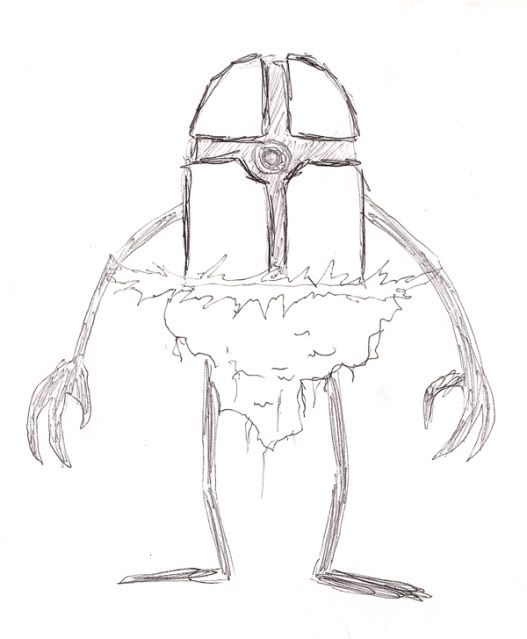
Hey everyone. I'm getting pretty close to submitting. There is really great competition, and by the looks of it, the odds of me (and my brother) winning are slim. And that is why I NEED YOUR HELP! So, I'll post a few examples of the works I've done on it. Please, give me feedback on the design, color scheme, and anything else you feel needs improving. I'm going to really need it!
This is the latest image:
http://pinataisland.info/forum/picture.php?albumid=421&pictureid=4344
I changed a few little things with the color and the face a little.
Here is my previously-to-be-final submission.
http://pinataisland.info/forum/picture.php?albumid=421&pictureid=4337
You can tell how I changed it from my most recent sketch. What do you think? Do the colors work? Does the concept need improving? Just to show you the progression, here are some of the other early concepts.
This one was the sketch of the one above.
http://pinataisland.info/forum/picture.php?albumid=421&pictureid=4338
This was one of the first colored versions I did. It is a bit blurry for some reason. but you can see several changes in the design. Good or bad?
http://pinataisland.info/forum/picture.php?albumid=421&pictureid=4336
Finally, here was one of the first (and worst) drawings I ever did of it.
http://i36.photobucket.com/albums/e10/Chief0072/scan.jpg
Thanks, and good luck to all of those submitting.

I wouldn't worry too much about trying to stick to the stats too much. Does Shaymin look like it should have 100 stats across the board?? Explain how a 5 pound hedgehog can have 100 base HP? :(
Yeah that's why I don't pay particular attention to things like that.
Yeah that's why I don't pay particular attention to things like that.

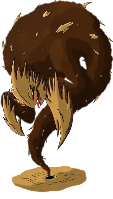
Final Submission
FINAL SUBMISSION

Dark/Ground Frilled Lizard thingy.
In all honesty, I am NOT done with this guy. However, due to unforseen circumstances, my computer broke, and this Wii Internet isn't exactly bundled with GIMP.
And since I'd rather be entered and (most likely) lose, rather than have been left out, this is my Final Submission.
Adios...
Yeah, I said something about this ages ago, but I don't think anyone noticed. Say, if the CAP had ended up with Sticky Hold, the Quicksand concept at the start of the thread would have been epic, but something like that turtle thing wouldn't suit at all.Which makes me wonder why art submission happens so early in the process. I mean, could you imagine how silly a lot of us would have looked if this CAP ended up having Levitate?
- Status
- Not open for further replies.