CAP 8 CAP 8 - Part 15a - Sprite Submissions

Status
Not open for further replies.
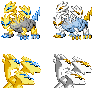
Final Submission


Male Normal------------Female Normal
Male Shiny-------------Female Shiny

This is my final submission unless anyone strongly objects to the shiny.
 
Several people mentioned that the left head on my front sprite needed to look at the opponent, not straight ahead "into the camera". Once people mentioned it, I agree that it looked a little weird. I tweaked that head to make the pokemon look over at the opponent.


I think it looks better like that. It's amazing what a difference a few pixels can make!
Ah, that definitely does look quite better! Although, upon comparison, I noticed you tweaked the border juuust slightly to help turn the head...
Although for some reason I think the nose now looks a bit fat...
Compared to the other two, at least. (Especially the one on our right...)

...And after looking at it a bit..
I noticed the eyes on your back sprite are huge. O.o
Could you shrink them a bit...?

It's hard to believe your sprite evolved from this:
Here's my first draft of CAP 8:

 
Alright, I've made yet another edit to my back sprite, and I'm liking it right now:


I made the heads even bigger compared to the body, and the necks as thick as I could without compromising the fact that they are supposed to be lightning bolts. (I'm still considering zooming in on the heads more, though) I lightened the yellow a tad and lowered the body slightly to make less of it show. Unless anyone has any more advice, I think I'll be making a final submission soon.
 
I'm really loving your sprites, Clawed Nyasu, but I think there's -something- with the backsprite's outline. It seems... jagged, or something like that.
 
I really wish the front and back sprites were done in different polls because I love KoA/Clawed's front sprite and Doug's back sprite is just incredible
 
I really wish the front and back sprites were done in different polls because I love KoA/Clawed's front sprite and Doug's back sprite is just incredible
I think the reason that can't be done is because each artist stylizes their submissions in different ways so that when you put a front and back sprite from two different artists next to each other, they will hardly look like the same Pokemon. Not to mention the palettes being different.
 
DougJustDoug said:
Your palettes are fine and I applaud your choice of layout for the back sprite, showcasing the lightning bolt eyebrows.
However, there are several points of major concern that would prevent me from voting for this if I didn't have my own submission in the running:
  • The front sprite's right rear leg. Just use the outline color; there is no reason to try to make it look "further away" by fading it. To quote the OP, "look at the ingame sprites for examples."
  • Despite the random jaggedness of the necks in the front sprite, you chose to smooth and straighten them in the back sprite. Pick one style or the other.
  • The use of gradient shading. Find me a real precedent from the ingame sprites and I might change my opinion.
  • The central and right head of the back sprite are menacing the right edge of my screen and not the opponent's Pokemon. At the very least, the central head should be the one looking at its opponent instead of directly to its right.
I know that those points would require a lot of work to address, but I feel that they would be a worthwhile improvement for one as concerned about the quality of CAP as yourself.
 
I notice a lot of clouds being... Bubbly? Clouds can be compared to mist, if you've ever flown, you know what I'm talking about. I understand they are among the toughest of cookies to sprite, fluff in general is. Mareep/Flaafy/Swablu/Altaria and sprites such as Aragornbird's (very nicely done BTW, definitely a top contender) might be the best references I can think of this quickly. Excuse me for the lack of technical advice. But this is all I can give you at the moment.


Just a bunch of shinies

Dunno if anybody noticed, but I have male/female differences. Female's tail is longer.

My favorite shiny is the cotton candy pink+ Pink eyebrows
From someone who loved your art submission, these aren't on the same level. The legs and neck look reaaaaallly short. The faces look a bit flat . The clouds and the tail look good, but you have to fix those other things to have a good submission.
 
I like seeing just the heads [on the back sprites] better than the body. Doug's is comin out great. The colors for both concepts look great as well. One thing though, I didn't notice it at first (which is good), but the back leg is too faded. It could be for good effect, but it's still a lil too much.

I do like the colors on the DarthVader's shiny design though.
 
Alright, I've made yet another edit to my back sprite, and I'm liking it right now:


I made the heads even bigger compared to the body, and the necks as thick as I could without compromising the fact that they are supposed to be lightning bolts. (I'm still considering zooming in on the heads more, though) I lightened the yellow a tad and lowered the body slightly to make less of it show. Unless anyone has any more advice, I think I'll be making a final submission soon.
I reckon you should either raise the height of the cloud to cover the necks a bit more or lower the heads a bit so they dont look like they are sprouting from the top of the cloud (see Darthvader's one)

The way you've dont it makes it look a bit clumsy. If you stare at it long enough it doesnt really look like the heads are connected to the body on second thoughts, but rather there is a yellow pokemon in front of a rock xD. The far left head is the one i have most problems with.
 

DougJustDoug

Knows the great enthusiasms
is a Site Content Manageris a Top Artistis a Programmeris a Forum Moderatoris a Top CAP Contributoris a Battle Simulator Admin Alumnusis a Smogon Discord Contributor Alumnusis a Top Tiering Contributor Alumnusis an Administrator Alumnus
Moderator
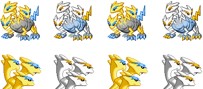
Final Submission


Based on feedback from various people, I made several small tweaks to these sprites, but nothing major. I sharpened the left face on the front sprite, and I made the backsprite faces and horns slightly more "pointy". I also darkened the back leg on the frontsprite, just a little bit.

This will be my final submission post. If I make any more changes, I will just edit the images here. Thanks to everyone that has given me advice and suggestions in this thread. With your help, I think my sprite is a million times better than my original draft. Regardless of the outcome of the polls, I've got myself a few snazzy-looking avatars to use in the future. I'm already a winner! ;-)

EDIT: New fronts as posted later in this thread.
 

reyscarface

is a Tournament Director Alumnusis a Social Media Contributor Alumnusis a Forum Moderator Alumnusis a Community Contributor Alumnusis a Tiering Contributor Alumnusis a Smogon Media Contributor Alumnusis a Dedicated Tournament Host Alumnusis a defending SPL Championdefeated the Smogon Frontier
World Defender
Beautiful Doug, just beautiful. Perfect dynamic pose, perfect colors, perfect. I love the design and you got my vote ^_^
 
Good work Doug; although just a side comment...
.......
.....
...

I can't spot the gender difference. ¯\(º_o)/¯


Based on feedback from various people, I made several small tweaks to these sprites, but nothing major. I sharpened the left face on the front sprite, and I made the backsprite faces and horns slightly more "pointy". I also darkened the back leg on the frontsprite, just a little bit.

This will be my final submission post. If I make any more changes, I will just edit the images here. Thanks to everyone that has given me advice and suggestions in this thread. With your help, I think my sprite is a million times better than my original draft. Regardless of the outcome of the polls, I've got myself a few snazzy-looking avatars to use in the future. I'm already a winner! ;-)
I can't really say that I'm thrilled with the front sprite, but the back sprites are the best ones I have seen yet.
There isn't always a gender difference for every Pokemon, as far as I can remember that is.
this is indeed the case. I personally can't say I thought of this as a pokemon that would have gender at all though.
 

DougJustDoug

Knows the great enthusiasms
is a Site Content Manageris a Top Artistis a Programmeris a Forum Moderatoris a Top CAP Contributoris a Battle Simulator Admin Alumnusis a Smogon Discord Contributor Alumnusis a Top Tiering Contributor Alumnusis an Administrator Alumnus
Moderator
Good work Doug; although just a side comment...
I can't spot the gender difference. ¯\(º_o)/¯
On most pokemon, the gender differences are very small, almost unnoticeable. There are some examples of significant gender differences, so I have no problem with CAP spriters making easily-noticed differences. But, I usually make the changes very small. On my sprites, the females have slightly larger eyes, and a slightly longer tail.
 
Status
Not open for further replies.

Users Who Are Viewing This Thread (Users: 1, Guests: 0)

Top