People should only post here if they are submitting something or are critiquing something, be it positive or negative. This is so the thread doesn't become clogged with "zomg niec art!"
Rules
1) Sprites should be inspired by the winning design from the Art Poll. It does not need to be an exact rendition of every detail of the design; "artistic license" is granted to all spriters. However, drastic deviation from the selected art design is discouraged.
2) All sprites (front and back) can have a maximum size of 80x80.
3) All sprites (front and back) must have a complete, unbroken, distinguishable outline. It does not need to be a black outline, but it must be clearly distinguishable from the adjacent interior colors of the sprite. Look at the ingame sprites for examples.
4) Sprites must be in PNG format
5) Use 8-bit truecolor (aka 8-bit RGB) or less. This does NOT mean 256 color mode.
6) Use transparent backgrounds
7) Fusions of other sprites are not allowed. All sprites must be scratch sprites.
8) Do not alter, fuse, recolor or otherwise modify another spriter's submission – unless the original artist explicitly gives permission.
Failure to follow these guidelines will result in the submission being disqualified and the post will be deleted.
Sprite submissions for the sprite poll will be selected by the me, based on preference and feedback in this thread. There is no process for overturning the my decision. If you are not comfortable with this stipulation, then do not make a sprite submission. Do not post any complaints here or in later threads.
Additional Information
There are 8 possible sprites:
Front Normal Male
Front Normal Female
Front Shiny Male
Front Shiny Female
Back Normal Male
Back Normal Female
Back Shiny Male
Back Shiny Female
In most cases, spriters submit a Front Normal sprite first. Once feedback comes in and the poll nears, they make the other sprites.
You do not have to make different Male and Female sprites, but it helps. Since there are only minute differences between most ingame male and female sprites, it’s not very hard to tweak the sprite for a different gender. Some spriters have made noticeable changes between genders, and that’s fine too.
Shinies are just recolors, so that’s not too tough. There’s lots of people that can’t scratch, that are willing to recolor your shiny, if you really don’t want to do it yourself. Just ask in the submission thread and you’ll get plenty of offers to help.
Please look at your transparent sprites against different colored backgrounds, not just white. In Shoddy, the sprite will be displayed on multiple background colors in the Team Builder and in battle.
Break the Mold-Click here to see the full post.
Offensive/Defensive Bias: Offensive 20-40
Physical/Special Bias: Special -20 and lower
Base Stat Rating: Very Good
Base Stats:90/60/65/120/70/130 Speed Last
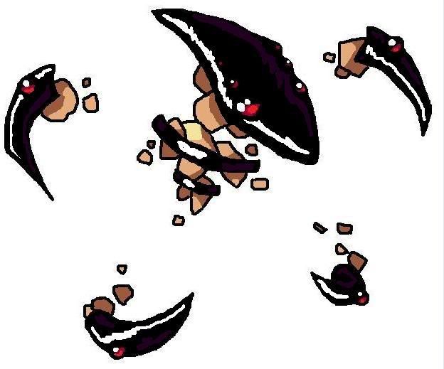
Art By yourDeadGrandad

More Poses:


Rules
1) Sprites should be inspired by the winning design from the Art Poll. It does not need to be an exact rendition of every detail of the design; "artistic license" is granted to all spriters. However, drastic deviation from the selected art design is discouraged.
2) All sprites (front and back) can have a maximum size of 80x80.
3) All sprites (front and back) must have a complete, unbroken, distinguishable outline. It does not need to be a black outline, but it must be clearly distinguishable from the adjacent interior colors of the sprite. Look at the ingame sprites for examples.
4) Sprites must be in PNG format
5) Use 8-bit truecolor (aka 8-bit RGB) or less. This does NOT mean 256 color mode.
6) Use transparent backgrounds
7) Fusions of other sprites are not allowed. All sprites must be scratch sprites.
8) Do not alter, fuse, recolor or otherwise modify another spriter's submission – unless the original artist explicitly gives permission.
Failure to follow these guidelines will result in the submission being disqualified and the post will be deleted.
Sprite submissions for the sprite poll will be selected by the me, based on preference and feedback in this thread. There is no process for overturning the my decision. If you are not comfortable with this stipulation, then do not make a sprite submission. Do not post any complaints here or in later threads.
Additional Information
There are 8 possible sprites:
Front Normal Male
Front Normal Female
Front Shiny Male
Front Shiny Female
Back Normal Male
Back Normal Female
Back Shiny Male
Back Shiny Female
In most cases, spriters submit a Front Normal sprite first. Once feedback comes in and the poll nears, they make the other sprites.
You do not have to make different Male and Female sprites, but it helps. Since there are only minute differences between most ingame male and female sprites, it’s not very hard to tweak the sprite for a different gender. Some spriters have made noticeable changes between genders, and that’s fine too.
Shinies are just recolors, so that’s not too tough. There’s lots of people that can’t scratch, that are willing to recolor your shiny, if you really don’t want to do it yourself. Just ask in the submission thread and you’ll get plenty of offers to help.
Please look at your transparent sprites against different colored backgrounds, not just white. In Shoddy, the sprite will be displayed on multiple background colors in the Team Builder and in battle.
Break the Mold-Click here to see the full post.
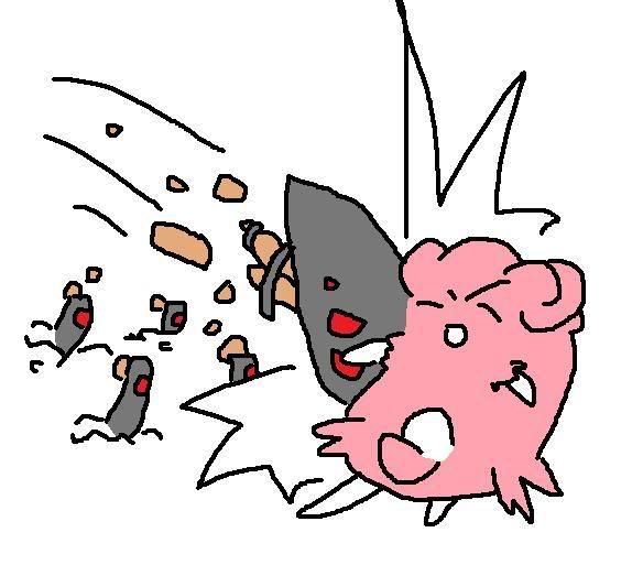
Type: Rocklatinoheat said:Name: Break the Mold
Description:
An OU viable pokemon that goes completely against the stereotypes of its typing.
Offensive/Defensive Bias: Offensive 20-40
Physical/Special Bias: Special -20 and lower
Base Stat Rating: Very Good
Base Stats:90/60/65/120/70/130 Speed Last
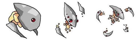
Art By yourDeadGrandad

More Poses: