
-
The moderators of this forum can be found in the CAP forum staff directory.
-
Welcome to Smogon! Take a moment to read the Introduction to Smogon for a run-down on everything Smogon, and make sure you take some time to read the global rules.
-
Congrats to the winners of the 2023 Smog Awards!
CAP 29 - Part 14 - Shiny Palette Submissions
- Thread starter Quanyails
- Start date
- Status
- Not open for further replies.


Magmajudis
Title pending
Final Submission


Final Submission

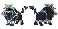
One of my original ideas for this shiny submission was white ink as a nod to white lions, but I couldn't get that to look good, so I instead went with this nifty dark gray ink color. For the ribbons and metal accents, I decided to roll with the idea of additive color that can be applied to the normal color scheme - yellow, as in the frame, is the result of combining red and green, as in the ribbons. Here, the ribbons are instead blue and red, which combine to form magenta, hence the nifty toxic pinkish-purple hue of the frame and other metal-like parts.
This color palette arguably fits the typing even more than the original, I think - black ink (Dark) and purple accents (Poison)!
WIP

I did this the other day and never got around to posting it. Based on Picasso’s Blue Period, specifically The Old Guitarist. Feedback is extremely welcome. Obviously, the back sprite is still in the works lol
I did this the other day and never got around to posting it. Based on Picasso’s Blue Period, specifically The Old Guitarist. Feedback is extremely welcome. Obviously, the back sprite is still in the works lol


Final Submission


Last edited:
Final Submission
Final Submission

There's no strong theme to this palette--I played around with colors until it looked nice. It's reminiscent of watermelon, according to some (including me). :P The white also reminds me of ivory.
I tried a lot of stuff out when it came to working on a palette, but the primary problems I had were the shiny use of lighting on the yellow, as well as the low number of colors on the purple. That nixed ideas like an all-chrome sprite. I also tried a sphinx-inspired palette, but I got feedback to try different colors since we had a lot of brown ones already, so I ended up settling on a nice red color. I intentionally colored the red so it was bright instead of making it blood-like.
Thanks to Darquezze306, DrifblooomCF, and Mos-Quitoxe for feedback, as well as everyone who helped vote on the palette!
Last edited:

Final Submission

Colours based on Picasso's blue period for our favourite Cubism chimera. I gave it a silver frame rather than gold, but tried to retain the original shine and kept it bright. As for the ribbons/horns, I simply swapped the colours with each other. I forgot about this, so simplicity is the end result for the ribbons.
Colours based on Picasso's blue period for our favourite Cubism chimera. I gave it a silver frame rather than gold, but tried to retain the original shine and kept it bright. As for the ribbons/horns, I simply swapped the colours with each other. I forgot about this, so simplicity is the end result for the ribbons.
- Status
- Not open for further replies.