CAP 10 CAP 10 - Art Submissions

Status
Not open for further replies.
Here's a new design I drew last night:


What do you guys think? I know it doesn't look very -Electric just yet; I'm hoping to show that through the colouring. By the way, the pads on the ends of its arms and legs are electrical pouches. I might have electricity jumping from pouches to the tips of the spines on its head and back.
 
Keishinkae: fffffff that plesiosaur's face is amazing. Although you're probably going with the gator, I am wholeheartedly in favour of your new monster.
 

Rocket Grunt

✁ - - - - - - - - - -
is a Top Artist Alumnus
im having a lot of trouble now choosing the best way to go with this design
i still like the green one best, but i tried using the red and blue design from earlier
i had to change it a little because the end of its head looks more like a screw-in lightbulb now
a blue and yellow one was suggested too so i tried that
i also took off the long fins and replaced the springy things on the end with straighter ones
i dont know i think i might just use the green one with all the fins and whatnot
here are the three i played around with:

red and blue
blue yellow
glowstick green

thanks for the encouragement and criticism

i dont even know what to say about this one
i think i like all the fins on it instead of just the tail
 
Rocket: I like the green and the red/blue schemes. Though I prefer the green one - it stands out to me more and gives me an idea of "electric". The yellow and blue looks overdone, i dunno, it just doesn't work for me - hope this helps!
 
Here's a concept art I just made, if this thing is still running.


It's suppose to be a lizard-type creature.

I tried adding some Yellow, and giving it those antennas on the eyes to make it more electric-looking.

EDIT - I'm probably going to do the next one on paper for better quality, as I cannot use a tablet to its maximum potential.
 
The tail, I feel, will need some sort of fin. Otherwise I don't see how it can control itself effectively in water. The dorsal fin and webbed hands help for momentum and turns (as well as protecting it from rolling currents) but the tail is the rudder. A quick example of how this works is humans have a hard time turning in water without having to thrash and throw our bodies around. Fish simply need a quick flick of their tail to turn. This of course also adds to the pokedex entries you can make. I don't think the standard fish tail will look good either, but I think putting a short fin membrane along a large portion of the tail will look good. Here's a quick example of what I mean, if you like it go ahead and tinker with the idea. This kind of tail means it won't be absolutely fantastic in control, but the presence of the actual tail muscle throughout the fin means it will be powerful.
This is pokemon, science does not apply.
@Nyasu: I think that you should keep the lightning bolts because without them it would be hard to tell if it was part Electric.
 
This is pokemon, science does not apply.
@Nyasu: I think that you should keep the lightning bolts because without them it would be hard to tell if it was part Electric.
What's wrong with MAKING science and biology apply to your Pokemon? If anything that adds awesomeness because you actually thought out your design.

Again there is no need for the extra electric apparel when overall it doesn't add to the design.
 
Here's the coloured and shaded version of my design:

Please critique this! Anybody think shading the spine thing would be worth it?

@Ditto-Chan: You have a reasonable design but it doesn't look very -Electric; you could fix that by simply colouring the 'eye-brows' yellow or a bright, hot colour. I'll attribute the weird line-art to your using a tablet so no worries there, although it looks a bit hunched over. Looking forward to seeing the next version :)

@Rocket Grunt: I really like your design. I have just one suggestion: make the fins look like light switches because it would add to how robotic it looks and the -Electric part.
 
The tail, I feel, will need some sort of fin. Otherwise I don't see how it can control itself effectively in water. The dorsal fin and webbed hands help for momentum and turns (as well as protecting it from rolling currents) but the tail is the rudder. A quick example of how this works is humans have a hard time turning in water without having to thrash and throw our bodies around. Fish simply need a quick flick of their tail to turn. This of course also adds to the pokedex entries you can make. I don't think the standard fish tail will look good either, but I think putting a short fin membrane along a large portion of the tail will look good. Here's a quick example of what I mean, if you like it go ahead and tinker with the idea. This kind of tail means it won't be absolutely fantastic in control, but the presence of the actual tail muscle throughout the fin means it will be powerful.
Alright, that is a good idea, I'll try to implement something like that

This is pokemon, science does not apply.
@Nyasu: I think that you should keep the lightning bolts because without them it would be hard to tell if it was part Electric.
Heh, gotta admit--I do LOVE making scientific explanations for Pokemon. =P Sure, you can bend the rules here and there, but there are still rules nonetheless.

~Nyasu
 
@Nyasu
I have to say that your design is my fave at the moment.

In terms of the chest, have you tried putting some sort of markings on it?
I think that it might make the chest look less plain, but (hopefully) not make it seem to cluttered.
 
All artists who have not yet done so are advised to mark their final submissions as soon as possible. You have until the end of the Secondary Ability stage, which is a few more days at most.

As an aside, I'm really loving a lot of the work itt. I'm no art critic (not by a long shot...) but Nyasu's, Doug's, Aragorn's, and Cyzir's seem to stand out. Of course, Zantimonius is as original as ever, and Cartoons and Rocket Grunt are amazing in their respective styles... yeah I'm really undecided so far!
 
I think Doug's final post is great but needs something to make it look more vicious, shifty and bulky in my opinion.
 
Noobiess, there's some lovely work gone on there. However, the problem is that it isn't really a dynamic image, also, it may be too complicated, (and you need to work on the eye. Make it stand out).
 
Noobiess, there's some lovely work gone on there. However, the problem is that it isn't really a dynamic image, also, it may be too complicated, (and you need to work on the eye. Make it stand out).
I know... but I read osemwhere that you couldn't make it too dynamic... So I started on the image and then I osugh the other entries... But I'm gonna try, and see what happens.
I also think the eyes aren't completly right yet.. I'll try something light, maybe yellow
 
This is most likely going to be my last review in this thread since we are now down to the wire and everybody will be making their final submissions here pretty soon. I just want to say that I really appreciate everyone's hard work here and wish everyone the best of luck in the polls.

@ CyzirVisheen: Yeah, I wasn't sure about that, so I thought I'd ask. I really love this design and it's been fun watching this one progress.

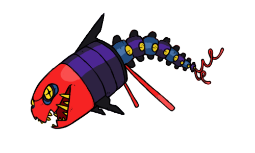
I really think that the bigger fish looks good in this design. I also like the color choices that you've made with each individual part of the piece, from the lantern's body, to the fish's body, to the antane... I think you pretty much have hit the nail on the head with the coloration.

I'm not sure what you have planned for the supporting artwork, but I certianly would like to see what the lantern part of the Pokemon would look like attacking... if that part even attacks (that fish that's attatched looks pretty vicious and may just be willing to do all the hitting).

Either way, this design does not dissapoint and you've worked very hard on this piece. I definately love it.

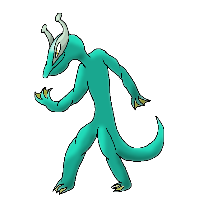
@ Doug-Just-Doug: It looks like your sticking with the original coloration. I think it looks great: the design itself is so different from Bibarel's that I did not think that the coloration was much of a problem in the first place anyway.

In regards to the teeth, I'd say the longer teeth just fit the design better. They make the Pokemon look more vicious and agressive, which I think is what you were going for with this particular design.

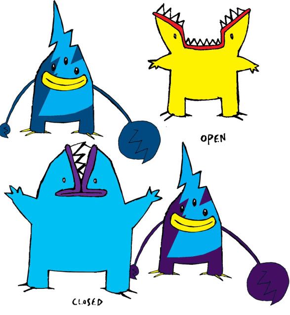
@ Rocket Grunt: Yeah, I think the green and purple coloration of your design from before looks the best. The blue and red one is also good, but it doesn't scream "perfect for this design" the way the green and purple did.

And I agree, the way the design looked in the previous picture did look a lot better: I figured that it might be something you could try, see, and decide for yourself.

---

All of you guys have done a great job and it's been fun reviewing the pieces and helping out as best as I can. I'll see you all in the polls!
 
Final Submission

Main Design:


Supporting Material:
Standing Upright
Attacking

It's a salamander with electricity generating spikes and armor plates. It's capable of standing upright as well as it's prefered quadrapedal stance.
Technobabble Justification of Trace: The spikes generate an electrostatic field that allows the Electric Salamander to alter it's electromagnetic field to mimic it's opponent, copying it's abilities.
 

Calad

Hero of the Blue Flames
is an Artist Alumnus
Final Submission

Main Design:

Light Bulb Jellyfish
/


A Jellyfish, clearly electric-water type.
I made this concept based on a Light Bulb Helmet for this kind of Jellyfish.
My Jellyfish emits incandescent light from his helmet and It can attack with thunderbolts from its tentacles or its antenna.


Supporting Material


Electricity!
First Design
 
EDIT BY DougJustDoug:
This user is an alternate account made by Bucky to prove that he is not only a smug asshole -- but that this is the best way for him to get a compliment on his design. Bucky has been banned from CAP 10 completely.
-----------------------------


To be honest, I'm surprised at the sheer lack of originality here. To those that, in my opinion, were actually original and fresh, here is what I have to say:

@ CyzirVisheen: the concept looks great but i think the very first color scheme was perfect. The new one is quite decent though.

@ BinarySolo: pure yellow doesnt look all that great. Try adding bits of color on the hands and fin at least.

@ Bucky: very cute concept, though I dont think the glowing eyes looks very Pokemon-ish. Loving it still.

@ Rocket Grunt: i love the glowstick green color scheme. I think if you tweaked it a little more, it would be just perfect.

@ noobiess: absolutely perfect. I'd go for a little less detail in the final submission but I love it still.


I decided to try my hand at revamping my sponge CAP. For one thing, jets=speed and sponge=HP, meaning it's fast, AND its decently bulky HP-wise. Its mediocre defense and special defense are shown by the fact Sponges really only have internal spines inside their bodies for self-defense, and likewise, I only gave my sponge spines on its body for self-defense.

It Traces stuff by using its "cannon" arm to squirt ink, tracing the foe's ability with its "bayonet" arm, and memorizing how to do it via its eye lense. So yeah.

-Torterra-Infernape-Feraligatr-
 
just added a semi comic to my final submission on page 16. Since trace is the main ability I figured I should explain and show how my mon would use trace.

he's released out of the pokeball, focuses his energy and the spirit armor stuff activates and traces the opponents ability resulting in what you see on the right.


Basically theres a mysterious energy inside the hollow shell (think shedinja I suppose but its not a separate pokemon, more like a guardian spirit)
 
added the colors and some shadings...

and of course the eye
http://www.iaza.com/work/100328C/lionfish331156.bmp
Any comments?

Cause it just doesn't feel completed yet...​
I'll tell you what the problem with this is, it looks like you just looked at a picture of a lionfish and colored it blue and yellow. =0 It doesn't have any specific feature that makes it look like a Pokemon... it's an interesting concept and nicely executed, but it needs to be 'more dynamic', as Alix pointed out.
 
Well, it's time to figure out the color scheme:

http://img193.imageshack.us/img193/7346/shrimp.jpg

Feel free to suggest other ideas if you have any.
So far it's pink and yellow. Should there be a third color?
@Aragornbird: I prefer the bottom left. I think you should add something to make it a little more electric because right now it looks about as much Water as Corpfish.
I have to agree with this right here; on both respects.

Over the course of the design, you seemed to just have slowly trickled away the electric-y aspects.
Specifically...
1. The two lightning bolts over the face (replaced with a... Raindrop?)
2. The jagged antennae. (Replaced with drooping ones, that also make it look abnormally unarmored and too fleshy. The drooping antennae are my least favorite aspect, personally.)
3. The jagged whiskers (Also made it look more armored.)
4. The lightning bolt "trim" on the lower edge of the tail.
5. The spikes on the bottom of the body-segments. (Well, they do seem to exist, though they are quite a bit flatter, and are non-existent on the front of it's body.)
6. The lighter body color. (The darker red also makes it look more "bloody" & "fleshy".)

...On another note, I think it would be worth trying the Top-Right color scheme, but switching the colors on the mid-5 body segments?
 
To be honest, I'm surprised at the sheer lack of originality here. To those that, in my opinion, were actually original and fresh, here is what I have to say:

@ CyzirVisheen: the concept looks great but i think the very first color scheme was perfect. The new one is quite decent though.

@ BinarySolo: pure yellow doesnt look all that great. Try adding bits of color on the hands and fin at least.

@ Bucky: very cute concept, though I dont think the glowing eyes looks very Pokemon-ish. Loving it still.

@ Rocket Grunt: i love the glowstick green color scheme. I think if you tweaked it a little more, it would be just perfect.

@ noobiess: absolutely perfect. I'd go for a little less detail in the final submission but I love it still.
I took your advice and I think I ended up with something better. Thanks!

Unless someone else spots something wrong with this one, I'll begin making my Final Submission material.
 
Status
Not open for further replies.

Users Who Are Viewing This Thread (Users: 1, Guests: 0)

Top