That swampert is too awesome.

-
Welcome to Smeargle's Studio! Please be sure to review the studio rules. Feel also free to check out our hub to learn more about this place!Welcome to Smogon! Take a moment to read the Introduction to Smogon for a run-down on everything Smogon, and make sure you take some time to read the global rules.Congrats to the winners of the 2023 Smog Awards!
ArtJustArt - The Art of DougJustDoug
- Thread starter DougJustDoug
- Start date
Oh my god, very amazing! I'd love to see more of your work man!The work is amazing, I saw Garchomp and was interested, then I saw Swampert and was hooked. I'm really looking forward to the upcomings in colour.
I would love to see a Gengar, there are good ones but never excellent ones. :) New sketch added to the OP -- check it out! Here's the thumbnail link if you don't want to go all the way back to the OP.

I've been very busy with programming some new things for Smogon and the CAP project and I have been spending very little time on art. I realized that it has been almost two months since I updated my art thread.
I've had an unfinished sketch of the Legendary Pixies laying around for quite some time. I finished it and I have added it to the sketches section of the OP. This sketch is my attempt to prove that all the pokemon I draw do not have to look like badasses. Although I don't like doing cute pokemon, I think I have the basic art skills to pull it off. You can't get any cuter than Azelf, Mesprit, and Uxie. We'll see how the final color piece turns out. I may reorganize the positioning of the three pixies, so I can do a translucent effect on their bodies. I think that would look cool. But, the individual posing is set.
I haven't had time to color anything recently. I think I will be doing Skarmory next. That sketch seems to have gotten the most positive responses so far.
As always, thanks to everyone that has posted comments on my stuff so far.Lovely work. The agressive stances make them jump off the screen. Love the badass lanturn and swampert ^_^ cant wait to see the progress ones colored.Wow, I am impressed with your artwork. Swampert looks strong and wise, like he knows what your next move is going to be... before you make it. Bravo!
I'd like to suggest Flygon as your next project. The spirit of the desert, I bet he will would look real cool with his red lenses and such!!
Keep it up!
As some of you may know, I submit designs into every Create-A-Pokemon project. I usually spend a lot of time designing and rendering them. For people that don't frequent the CAP forum, I thought you might be interested in the pieces I have done for the various CAP projects. Not to mention, my art thread could use a bump.
I will make a special section in the OP, and over the next few days, I will make posts for each of my CAP designs. Starting with....
[THREAD=35119]Click here to see my full Gallery in the OP of this thread.[/THREAD]CAP 1 - Ice/Bug
This was done for the first Create-A-Pokemon project, long before there was a forum, a server, or any rules. Everything was new and there were almost no boundaries on the designs. The Ice/Bug typing had been selected, but not much else. I decided to make an alternate evolution for Trapinch, therefore this design has several similarities to Flygon.

Description
The idea for this stemmed from the fact that Flygon is in the Bug breeding group. Trapinch and Vibrava are obviously bugs, and I think Flygon looks very bug-like as well. So, when we decided on Ice/Bug, I thought of a Flygon sibling that was from snowy mountaintops instead of the desert.
The skis were really the "signature element" of this design. In fact, my working name for this design was "Ski-Bug". I came up with other variants of skiing bugs, but this was the one that I liked the most.
The wings are supposed to look like sheets of ice. Flygon's wings are have a triangle-ish look to them, so I tried to follow with that general geometric theme. The coolest part of Flygon's design, IMO, is the little covers over its eyes. I duplicated that here, but opted for an ice blue tint. The translucent effect on the eyes and wings is another fun part of this design. This was the first time I made a custom texture in Photoshop. I used it for the skin. I also really enjoyed the little ring-spots on it's back.
I ended up coming in 4th place in the competition. I was mercilessly lambasted for making "a Flygon ripoff", despite the fact that I was intentionally making an alternate evo. I learned a big lesson on that first CAP project - never make a design that requires any explanation. The design must "stand on its own"; the artistic representation by itself. Oh well... live and learn.Last edited:
Well, my logic was a bit flawed, but I was young and stupid... ;-)Suprisingly, I don't remember you being blasted for making a Flygon-ripoff, and only just now I realize that it looks like Flygon. Though, how would a Ground or Ground/Dragon go to Ice/Bug? I still like it a lot.
I didn't win and, in retrospect, I didn't really deserve to win. The other pieces were better. Quit rubbing salt in the wound. ;-)
[THREAD=35119]Click here to see my full Gallery in the OP of this thread.[/THREAD]CAP 2 - Ghost/Fighting
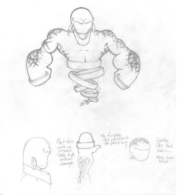
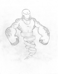
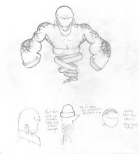
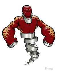
In my opinion, Fighting and Ghost are two of the coolest, badass types in the entire game. So, once CAP2 selected the typing, I was determined to make a total badass pokemon design. This was what I came up with...

Sketches
Here's the "final" sketch and the working sketch that I used to flesh out the basic concept.
(click thumbnails for full image)
Alternate Color Schemes
These were part of an "Easter Egg" in the CAP2 art thread. But, there's no reason to keep them secret any longer.
(click thumbnails for full image)


Description
I had so much fun with this design. I drew up the first sketch on a 4-hour plane trip from New York to Texas, and my mind was racing with all sorts of weird ideas. Here's the full backstory that I posted in the CAP2 art thread. If you take the time to read all that, you will see there were lots of influences. I poured all those references into the design, and then noodled on it endlessly in Photoshop once it was rendered digitally. I was very pleased with the final result. At the time, I thought it had a legitimate chance to win.
The general theme is a "Fighting Djinni". So there's all sorts of mystical and tribal flourishes in the design. The best part of the drawing, in my opinion, are the tattoos. Tats are badass-looking in real life, and I think they are badass-looking here. I painstakingly inked them with vectors, and the resulting clean lines really paid off. I colored them red, because red "feels" like Fighting to me. The gold rings were a bitch to color in Photoshop, but bring an original element to the drawing. It's a twist on the cliche Djinni smoke trail, but still gives the impression of an ethereal lower body.
I was criticized for it looking too much like a superhero or super-villain. Not surprising, considering my extensive background and training in comic book illustration. I didn't think it was overdone, but like many CAP designs -- the "it doesn't look like a pokemon" comment came up a lot during voting. Despite the criticism, this design did very well in the art polls. I came in third (or 2nd, depending on how you look at it) to KOA's winning mummy design. No offense to the current Revenankh design, but of all my CAP designs -- this is the one I most wish would have won. KOA's design is awesome, but I REALLY liked this design. It was so much fun to work on, and I think it looks completely badass.
The big lesson I learned with this design, was to avoid making them too "human-looking". My superhero comic art background makes me naturally go in that direction, so I specifically try to resist that tendency on all new CAP designs.Wow, Doug. I normally am not a fan of any type of CAP type things (DONT HURT ME!)
BUT. This ghost/fighting guy (almost genie of the lamp-ish) one is awesome. I'd have to use him on my team if he was in the game. I love the tattoo type stuff along his arms and back. Definitely adds to the bad-assery.
[THREAD=35119]Click here to see my full Gallery in the OP of this thread.[/THREAD]CAP 3 - Grass/Fire
This was my worst CAP design to date, in terms of art quality and vote totals. I had a moderately intriguing premise of a Jack-O-Lantern, but I was busy with other things and really didn't invest a lot of time into the design. I didn't even take the time to ink and color it properly. So, I'm showing the pencil sketch first, since I'm not very proud of the half-assed coloring I did later.
The working name for this design was "Hallowmean"...


Description
This idea evolved from some discussions during the typing polls for CAP2. In CAP2, the Ghost type was selected first. During the secondary typing poll, Grass and Fire both received a lot of support. At that time, the concept of a Jack-O-Lantern was mentioned. I liked the idea, and remembered it when Grass/Fire was selected for CAP3.
The HUGE problem with this design is that it simply cannot escape the fact that it looks like a Ghost. I rationalized the typing a million different ways. I tried to point out the pumpkin, thorns, and green body coloring to support Grass, and the Fire is very obvious. I also explained that many pokemon have a "third" type that cannot be expressed in their formal typing, but is represented in their movepool and/or breeding group. I pictured this pokemon getting some Ghost moves to support the obvious Ghost-ness of the design. My explanations didn't really catch on. Everyone dismissed the design with "Great picture... but it looks too much like a Ghost".
Frankly, I agree with them.
At that point, I was really busy and I knew I didn't have time to come up with a new design. So, I slapped a little color over the top of the pencils (I didn't even bother to ink it), and pretty much gave up on trying to win the competition. And, the votes reflected my lack of effort. I received a whopping 2 votes out of 252 votes cast -- tying for dead last. Ouch.
Artistically, I like some of the things about the drawing. I made a concerted effort to not make the pokemon too anthropomorphic. I also think the combination of thorns and fire made for a wicked combination. In my lazy coloring attempt, I discovered that blending color on top of pencils can produce an interesting effect. It's not the clean look that I like in most of my drawings, but it's not completely horrible either.
Lesson learned on this one - "You get out of it, what you put into it."Last edited:Wow, I like your work Doug but perhaps what I like even more so is the fact you leave long detailed explanations of the processes of how and why you made the art and that's something that holds my attention. I've got to admit though, your CaP designs have been rather lackluster and your fanart does a lot better in my mind. Perhaps an added reason to why your pumpkinheaded design didn't do well is perhaps that somewhere in the back of everyone's minds they noticed just how similar in structural design it was to Revanankh and your last CaP design, it wouldn't have been nice to have something too similar.
Your art is simplistic and pleasing and i'd love to see more.Dude I would love to see either a Flygon or Kingdra from you. They are two of my favorite pokemon, and I think you would do a badass job on them.I agree with *Hen*. Your "Ski-Bug" looks more like a Pokemon, while your last two don't. Agreeing that they are both great pieces, but they don't look like Pokemon. The "Fighting Djinni" looks like something that might appear in Golden Sun or something, and the "Hallowmean" reminds me of Halloween from Mar.
Excellent job, though. You have a lot of creativity. I especially love the thorns on Hallowmean. Badass.These are really good doug! But did you have art for cap 4?Users Who Are Viewing This Thread (Users: 1, Guests: 0)
- ... and 1 more.