Just a minor flaw to point out, the tail looks very off center. Aside from that I really like the idea (Too many bipedal dragons!)
Edit: Just realised that's a fourth claw, still looks a touch off though.

Curse Photoshop and its constant crashing.

I'll do my other designs over the next few days. Grah. This was a haphazardly drawn design, just to get the feel of the colors. Any suggestions on color changes etc.? And what colors do you think would make my other designs cool?
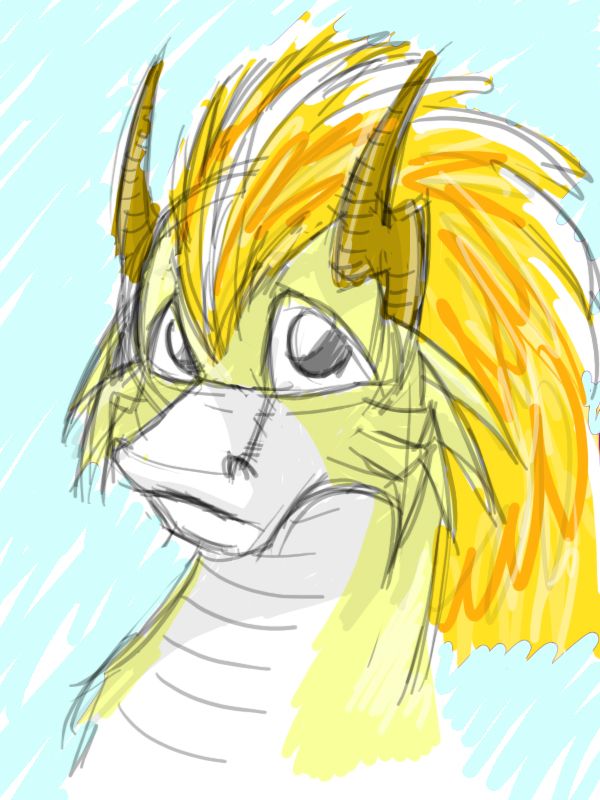
I think this one is pretty cool, though other than the horns it's hard to see the electric from just a headshot. As for the color scheme, it looks fine to me though it's never a bad idea to try other colors.A very sloppy colour plan for another design I came up with. (Not that much different from my old one, actually)Code:[IMG]http://i418.photobucket.com/albums/pp268/chomzloh/dragon.jpg[/IMG]
http://i418.photobucket.com/albums/pp268/chomzloh/electricdragon.jpg
All comments welcome. Does anyone think I need to tweak the colour scheme?
Awesome design!That actually was the intent. See, the original image I posted was meant to be an Electric Eel Meverick in a Megaman X fangame, and eels are naturally nimble and lithe. I figured having a dragon be just as nimble isn't necessarily a bad thing.
With that said, here's latest adjustment #I forget. Darkened the blue a tad and changed eyebrow color as well as removed any pube-ness of the beard.

This is superb. O.O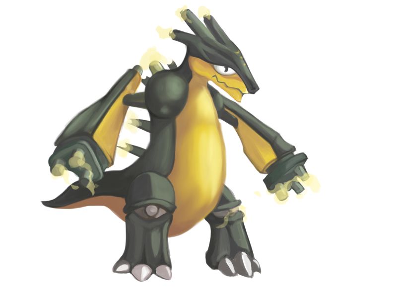
here i coloured it
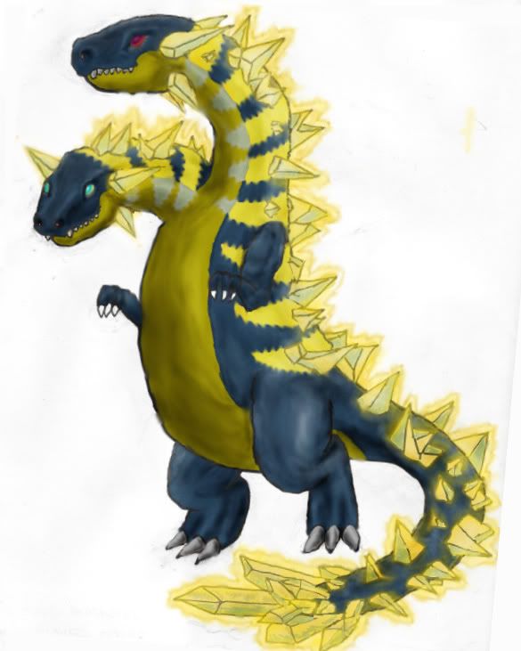
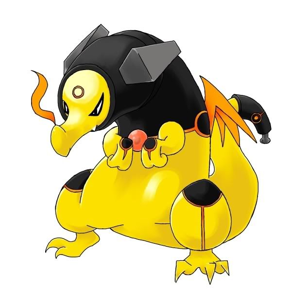
Looks even better, GK. I especially like the stripes on the body, how they change from yellow to gray as they go towards the stomach. Awesome :). Also, I like the alternate glow, the more "electricky" one.Alright, I did more touch-ups and I've added an outline to my glow, since I believe it's central to my fakemon. Sorry Doug if you think it's cliche! I also, needed to know if the outline on the glow is good enough to be legal?
and not to be egotistical but doesn't the "good head (the one with blue eyes)" look pretty awesome?
Also, just to note, the only crystals that do not glow are the four that are on each head.


I really like this, but I do agree, the paw in the air feels awkward.
This has my vote, if not really close. It's just so... different. o.oI originally had them but they weren't very clean so I decided to omit them. It looked surprisingly good too, but I didn't know about that rule.
Sorry about that...
Final Submission
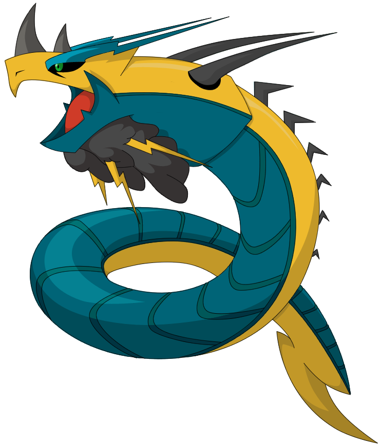
Whoa, Blu, this is awesome! I love the sinister look! If anything, try to make it more electric, but I love it the way it is!Tried to color it in Paint.

Yilx, that looks really, really good! I can't believe you took off the outlines in the first place!?! The outlines really add a lot of "pop" to the art, IMO. I love your design, color choices, and shading techniques. Nice job.I originally had them but they weren't very clean so I decided to omit them. It looked surprisingly good too, but I didn't know about that rule.
Sorry about that...
Final Submission
http://img.photobucket.com/albums/v407/Yilx/drag_O.jpg
The shoulders+legs remind me somewhat of Metagross...I originally had them but they weren't very clean so I decided to omit them. It looked surprisingly good too, but I didn't know about that rule.
Sorry about that...
Final Submission
http://img.photobucket.com/albums/v407/Yilx/drag_O.jpg