Judge a Pokémon: The Smog's 9th Art Panel
| « Previous Article | Home | Next Article » |
Hello, and welcome to the 9th Judge-a-Pokémon panel! Sorry for our absence last issue, and thanks to Birkal for setting it back up. Continuing on through the generations, this issue we're judging the designs of the fourth generation. From the big bad dinosaurs Dialga and Palkia to the appropriately festive Abomasnow, we look through some of DP's most notable designs. DP was the first game series for the DS, and with that came its graphic capabilities, allowing the increased complexity of designs from ADV to continue on. It also featured numerous evolutions of previous Pokémon, a move considered unimaginative by some fans. To guide you through the generation's designs today we have Birkal, with a Rotom avatar; Bummer, with a Noctowl; Fatecrashers, with an Octillery; Kevin Garrett, with a Chimchar; and RitterCat, with a Purugly. Merry Christmas from the JAP crew, and we hope you'll have a good time reading our commentary.
Dialga / Palkia

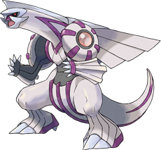

Dialga and Palkia both have very sleek designs, which I find to be appropriate for what they stand for. Time, and most of all space, is something which doesn't have any particular shape or color. And since they also need to be somewhat similar in design, it'd be difficult to incorporate something we associate their respective trait with without throwing off the symmetry. Out of the two, I favor Dialga the most, as its cold color scheme along with the futuristic arrangement of its steel parts doesn't make it hard to believe it represents the Pokémon of time. Palkia doesn't make that connection as obvious from my perspective, but its body armor riddled with purple shapes make it at least complex enough to be treated as a space overlord. With that said, neither of them makes that much of an impact on me. They're elegant and stylish, like marble statues or abstract paintings. I can admire them, maybe even be in awe of their appearance, but their calibrated looks and bodies saturated with details are what's preventing me from pointing towards either and proclaim "I want THAT to be on my team". Granted, I've never been one to favor legendaries within my battle roster, but these two make that preference seem more justified. Although it's worth mentioning that their father and weird cousin, Arceus and Giratina-O respectively, don't strike me with the same impression, which I assume can be attributed to their somewhat simpler designs.

Don't get me wrong; these Pokémon are awesome and were major thugs in the DPP Uber metagame, but they could have been better-looking conceptually. Besides the fact that Palkia resembles part of the male anatomy, they are both basically dinosaurs. They are said to rule time and space, but if you weren't told that in the game you would have no idea what they control. The only subtle signs you can pick up on (and they are a stretch) are that Dialga's wings resemble a clock and Palkia's wings look like they jet out and cover large distances. In past generations there was no mistaking Mewtwo was a genetically altered human, that Ho-Oh rose from the ashes like a phoenix, or Kyogre expanded the oceans. The failure stems from the inability to differentiate the two Pokémon. If Palkia was an entirely different species, you can say that Dialga represents time because it is a dinosaur. It might have helped too if they gave them different primary typings, Palkia in particular. Dialga's primary Steel typing is at least plausible, since Steel stands the test of time. However, they made Palkia a Water-type, which is more of a medieval view of space than our current method of long-distance travel through the air. It would make more sense for it to be a Flying-type. The one cool thing that comes out of the typing they were given is that they both resist the other's primary type. That at least makes them appear to be equal, until you get to the part where Dialga isn't weak to Dragon attacks...

So messy, so complicated. Whatever happened to the days when legendaries had clean, elegant designs? Think Mew or Articuno. Instead we get these two atrocities, which looks as though Game Freak just instructed their artists to take a biped and a quadruped form and keep adding spikes, stripes, and other 'flourishes' until they looked sufficiently powerful enough. Nothing about these two Pokémon really tells me that they're supposed to represent space and time, and let's not even go down the road of Palkia's unfortunate phallic resemblance. The complicated designs also serve to make these two look extremely static, as in you can't really imagine them in any other poses, making them bland subjects for an artist. Time to take a look back at the good old days, Game Freak.

I hold the belief that these two legendary Pokémon revolutionized the way Game Freak would design all its legendaries in the future. Looking at Kyogre and Rayquaza, you can easily identify their simplistic form, scattered with a few ornate accents of rings and lines. Palkia and Dialga, on the other hand, are absolutely decked out to the teeth with massive chunks of minerals sticking out of their bodies, layers of armor stacked on layers, and other complexities. From my standpoint, their design is clunky and messy, and that changed the outlook of all generation four Pokémon designs.
If you've ever talked to me when it comes time for CAP art submissions, you know that I am a diehard fan of simplicity. Some of my favorite Pokémon designs are incredibly basic, like Vileplume, Gengar, and Quagsire. When generation four came around, the complexity ramped up to greater levels than ever seen in the past. The likes of Garchomp, Toxicroak, and Torterra became the face of Pokémon with their design intricacy. Palkia and Dialga are the epitome of this philosophy; they were the most complex Pokémon we had laid eyes on. In my opinion, these two Pokémon truly destroyed what standards had already existed for Pokémon designs; simplicity was no longer valued. Palkia and Dialga revolutionized the way Pokémon were created. I feel that this was for the worse, but I'll leave you to make your own opinions on the matter.

One of the important things box legendaries need to do is draw in the eye of the buyer and get them interested in the game. These big, badass dinosaurs certainly do so, but where they succeeded is also where they failed. The focus seems to have only been on looking big and badass, instead of actually making sense design-wise. Powerful designs? Check. Legendaries? Without a doubt. Lords of Time and Space? Not so much. Standing alone, the designs are cool. Standing alone, the concept behind them is cool. Together, they make no sense and end up in two Pokémon stuffed with details and features, none of which have any meaning. The same seems to have happened with their typings, which seem to concentrate more on being interesting than relevant to their concept. So while they might have succeeded in the role of a box legendary, they failed on so many other counts.
Infernape

If the goal was to make a fire monkey Pokémon based on Sun Wukong, then Game Freak couldn't have done much better than Infernape. Infernape's design is sleek yet powerful, though the presence of flames on the head is a bit too predictable. The yellow markings present on Infernape's torso and joints are a nice touch, and serve as a throwback to the armor that Sun Wukong is classically depicted with. I just wish it didn't rehash Blaziken's typing, but that's an issue for another kind of debate.
Being the fully evolved form of my favorite Pokémon makes it the best of them all. For different periods during the development of DPP OU it was one of the most threatening Pokémon, consistently staying in the top 10 in usage with a minor drop off during Latias's reign. Conceptually, the entire Chimchar evolutionary line is interesting in how ambiguous it is. Chimpanzees are the apes with the closest percentage of shared DNA with modern humans. It evolves into Monferno, which is a mandrill. They are closely related to baboons, but not included as a great ape. Infernape is where it gets interesting because it retains some qualities from Monferno, but also develops humanoid characteristics. It doesn't make sense in terms of anthropology. Infernape gets a pass because it is based on Sun Wukong from the epic Chinese novel. I never would have known that without looking it up, but what I can figure out on my own are the similarities between Infernape and Goku, who happens to be the Japanese interpretation of the same character. Being the Pokémon version of Goku makes it pretty darn cool.
This hotheaded monkey has a design which fully reflects its battle approach: a full offensive at dazzling speeds with little to no bulk to back it up. Its slim body with thin, strong limbs sends across a clear message that this warring primate should take no hits for the team, but instead unleash a flurry of strikes upon the opposing side as quickly as it can manage. While Infernape was the first to suffer from the FFTA syndrome (Fire / Fighting Type Again), it differentiates itself from Blaziken rather well as its design allows it to utilize its whole body in its offensive onslaught, with Close Combat and Flare Blitz being its two primary moves, which has allowed it to excel on the battlefield since its own dawn. Its yellow body plates thankfully gives this monkey a more warrior-like appearance, thus setting it further apart from its Primeape and Vigoroth brethren, although its fiery scalp already makes it stand out among the various monkey Pokémon available. While it's not my favorite Gen IV starter, it's certainly rocking the second place, and remains as one of the better arguments why the Fire starters are a safe bet to rely on.
This is a whack-lookin' Pokémon. It has yellow swirls scattered across its body, blue digits, and an open flame spouting out of the back of its head. I immediately think to the original monkey Pokémon (Primeape) whenever I see Infernape, and I can't help but make comparisons. Primeape is so tough in its design; you can tell from looking at it that it's going to mess you up with those cuffed fists and feet. Even Aipom is a fluid design, despite its awkward hand-tail. Infernape's looks pale when compared to these two; it's a jumbled accumulation of too many ideas that resulted in a cumbersome design.
In my opinion Gen IV had the best starters, both in-game and aesthetically, but I still always chose Infernape for my runs, and for good reason. It's not only a complete wrecking machine in-game, but it has one of the coolest designs of all starters, up there for me with Venusaur and Sceptile. I have to disagree with Birkal here, as while designs can be too full of details, sometimes the details add to it. On Infernape, the little things become really interesting once you learn of its basis on the Chinese monkey king. Its gold bling looks a bit oriental to me, and its pointy head features hints at a crown, both of which link into its origins nicely.
Or maybe I just like it cause it's head is on fire. That's instant coolness points on anything.
Honchkrow

For the past two entries, I've been berating you all with the idea that "ONLY SIMPLISTIC DESIGNS ARE GOOD". However, I do believe that complexity has its place in Pokémon if done in good taste, such that the design is still fluid. Honchkrow is an excellent example of this. Its color palette goes great together, its expression looks conniving, and it generally looks like it's up to no good. Honchkrow exudes coolness and classiness, and that brings the design together into something simplistic. Even its hat crest, which I would normally consider a gimmick, is well-implemented into the design with some clever coloring and complementary edges. Honchkrow is one of the few times where Game Freak got it right in generation four, in my opinion. Thank you for granting us with one of the best bird Pokémon to date. Caw.
I think we can all agree that the numerous evolutions in DP were pretty hit-and-miss. Some were just "let's make it bigger and give it super rocket blasters or a drill or something," like Magmortar or Rhyperior, or plain stupid, like the mecha-Mr. Potato Head we all know and love as Probopass. However, some were really solid designs that built upon and improved the previous evolutions, like Gliscor, Magnezone, and Mamoswine. Honchkrow was another of these. It took the boring little crow with a hat and developed it into a full-on gangster mob boss. Its design is ingenious, using feathers to form its white crest on its chest—as if it's wearing a suit—and its big, mafia-style hat. Its eye and beak give it a menacing glare, and the dark navy coloring with a touch of red fit with its Dark typing and its mob boss flavor. Honchkrow's great design goes to show what a good evolution can and should do, so it's a shame that this wasn't mirrored in all of DP's cross-generation evolutions.
Honchkrow is one of those Pokémon which, despite lacking the ability, could probably Intimidate the opponents regardless. The extra bulk, might, and class the Dusk Stone has granted its feathery hide is visualized well in the official art and sprites alike, and while blue and red are usually two colors that don't mix well, they're both used in moderation in this design. Its hat-like ornament resting upon its head seals the deal nicely, although one wonders how it can arrange its feathers in such a manner in the first place. But with the exception of the avian fedora, everything else about this bird is very subtle but together paints the image of a fearless mobster which would hardly hesitate to cut its opponents some sweet deals. Or apart. Whichever fits its plans better.
Diamond and Pearl received criticism from some fans because there were too many evolutions of Pokémon from past generations. If you ask me, the criticism was completely without merit, based on the quality of Pokémon created. Collectively, this generation were the best-drawn since the originals (you can also extend that to GS). With the exception of a few, like Magmortar, that completely ruined their evolutionary line, the evolutions are well done in how they maintain the feel of the originals while injecting them with some fresh blood. Honchkrow is no exception. I never thought much of Murkrow in GS; it was just the a basic bird to help introduce the Dark-type. Just looking at Honchkrow, you can tell that it's a boss. The feathers that form a hat with its large beak, and eyes that would make it a terrifying predator at night. The white crest of feathers on its chest almost make it look like it's wearing a suit, which further plays to the role of being a boss in a sort of bird mafia.
Arguably one of the most badass Pokémon designs to come out of the DPP generation, Honchkrow's design is in my opinion impeccable in every way. The headdress and the white chest feathers convey perfectly the mob boss idea, and the red feathers throw in just enough contrast on the dark palette to make the design interesting. It's also very believable that Honchkrow's design would spring organically from Murkrow, and you can just imagine a boss Honchkrow ordering his gang of Murkrow minions around. Honchkrow truly is an evolution you cannot refuse.
Chatot

This is a Pokémon hastily cobbled together so Game Freak can claim that they didn't forget about the DS's microphone, and, boy, does it show. Chatot's color scheme encompasses every color in the rainbow, and needless to say, it's a total mess. The quaver-shaped head looks bizarre, unnatural, and totally off-balance, and it's easy to imagine that Chatot could topple over at any second. The metronome tail and the impresario-style feathers around its neck are there to reinforce the musical motif, but really they just add to the chimeric and clumsy nature of Chatot's design. Plus, I bet Nintendo didn't bet on kids using Chatot to call each other obscene things over Wi-Fi; I honestly can't think of a Pokémon that's overall more poorly thought out.
Chatot was Diamond and Pearl's answer to Farfetch'd. It's a Normal / Flying type with a small, innovative design and lacking a bigger, cooler evolution. Chatot was literally innovative in that it exclusively gets access to Chatter, which allows players to record their voice with the Nintendo DS microphone for the move. The only real use for Chatot is for novelty. And that gets me back to wondering what could be if it had an evolution. Parrots are amazing animals between their bright feathers, advanced vocal capabilities, and long lifespan. Especially because of that last point, you would think it would get an evolution. Maybe it's better off that it doesn't get one, though. As it stands now, Chatot is a pretty Pokémon aesthetically with a brilliant use of musical symbols in the design that leaves us full of wonder. An evolution might only ruin its splendor. Unlike with Murkrow, there are a number of things that stand out about Chatot to make it unique.
Show me a Chatot, and I will show you a Pokémon that I'll be storing in the PC for an indefinite amount of time. I can understand its design. I see the musical references they've added to it, and a parrot is a fine candidate to fill that role, as their vocal capabilities are quite extraordinary. But it's just. Too. Forced. The note on its head, the metronome tail, the white composer collar, four primary colors battling for superiority, all of them squeezed into a tiny parrot frame, and you have a Pokémon which appears to have evolved to exclusively inhabit circus tents. It has a unique niche, I'll give it that, but this is an excellent example of how some designs aren't subtle in the least, but instead rushed and overdone. It's a pity, because I really like parrots.
Remember how I said before that extra details can add to a design? Chatot is the complete opposite of that. Apparently for Game Freak, the fact that parrots are known for their vocal capabilities was not enough for us to get its gimmick. No no, instead they took a cute little parrot and shoved on as many musical references as they could. With its metronome tail, conductor's collar, and its entire head as a quaver, Game Freak could rest assured that no one would ever mistake it for anything other than a musical gimmick. Add on a color scheme designed by a two-year-old and they could rest assured that no one would call it a good design either.
If you knew me in real life, you'd probably assume that Chatot is one of my favorite Pokémon of all time. I'm a music major in piano performance, and I'm obsessed with music theory. Furthermore, I love birds; I fully intend to be the proud owner of a keel-billed toucan someday. Please ask me about it on IRC sometime; I've researched this stuff to death. So when you combine those two loves into one Pokémon, it should be a(n) (a)rousing success, no? Unfortunately, Game Freak screwed up with Chatot in probably the worst way possible. The yellow, green, and blue coloration does not work well together at all, and the white cuff around its neck is incredibly awkward. I can live with the metronome-like tail reference, but the eighth note head (quaver for you English chaps) crosses the border into the abhorrent land of phony and gimmicky. Thank you, Game Freak, for mashing together the two great passions in my life into what can appropriately be called the Frankenstein's monster of Pokémon.
The only cool part about this Pokémon is its signature move: Chatter. For all of you Pokemon SHOWDOWN! players out there, I'm still trying to convince Zarel to implement this move on the simulator. Nothing beats sending out Chatot with a loud "EIEIEIEIEOOOOO" to intimidate your opponent.
Abomasnow

The Smog is about to spread its political agenda. With the recent re-election of Abomasnow, Smogon needs members with at least four badges to pay more in taxes. As a result, forum administrator mingot has moved the majority of his badges overseas to avoid the tax hike. I offered my trophy to a charity of Abomasnow's choice if he would release his birth certificate. Alas, he could not be reached for comment. That is because there has never been an actual sighting of the abominable snowman. Abomasnow is an exemplary Sinnoh Pokémon, starting with its concept. The region is partially covered in snow and there were no Pokémon that could summon hail to the battlefield prior to this generation. The yeti and tree combination works really well with branches and leaves defining key parts of its design. The only part of the design that isn't part of a tree are the eyes, which is clever considering any claimed sightings of the yeti are blurred by the wilderness. Meanwhile, I still suspect Abomasnow came from PokéSav...
I had, for the longest time, wished for a Pokémon to incorporate both Grass and Ice in its biological machinery. So the sight of this forest juggernaut among the new Pokémon within the Sinnoh region made for a smile worthy of a doctor appointment. But as my excitement began to settle and release me of my euphoric haze, the fact that it's more of a vegetable beast rather than a sentient tree did dampen some of my original hype; still, the notion of being based on Bigfoot or any other mythical wood legend compensates rather well for that. My obvious bias aside, Abomasnow makes for a fresh break from other grass species whose plant origins are blatantly exposed, and instead pictures a new brand of creature shrouded in snow and disdain. That, and a strong contender for best use of chest hair among all Pokémon. My only complaint is its pine cones on its back, as they're simply protruding from its body rather than hanging down from it. That is, if those ARE pine cones. Could be tumors for all we know.
On paper, a Pokémon that combines a tree and the abominable snowman sounds like a swell idea, but in practice, the outcome that Game Freak delivered is less than impressive. I get that abominable snowmen must retain some fat by nature of their habitat, but the chubbiness really makes Abomasnow look weak and dopey, especially combined with its typical pose where it raises its hands and puts on its angry eyes. The little details about Abomasnow undermine its design as well, and while I've got no beef with the hands and feet, the whiskers and chest "fur" that it sports and the "eyebrows" around its eyes look like a toddler scribbled them on at the last minute. Plus, what's the deal with the tail? That just seems like a completely unnecessary addition which gums up the design even more. There are so many better ways that the Snover line could have been realized, none of which should ideally involve a fat Christmas tree with messy scrawls all over it.
Getting an abominable snowman design is pretty easy, even if it doesn't make the most interesting Pokémon. Make it big, white, and undefined, and you're done. Getting a Christmas tree design right, on the other hand, is much more difficult, and if done badly can lead to a horror with baubles for eyes, tinsel for arms, and a star on its head. Snover does it surprisingly well—an adorable Pokémon that I would hug if it didn't freeze me to death in a hailstorm. When upsizing to Abomasnow, however, the designers were much less careful about getting the Christmas tree wrong, so while Snover was a fairly even mix of tree and snow monster, Abomasnow is a yeti with green arms and legs and weird pine cones sticking out of its back. Unfortunately, this means the rest of it has to be big, white, and undefined, which leads to an overall bland design.
By now, you've read a bunch of other opinions of Abomasnow. You wanna know what I think of it? B+. Now that that's over with, let's move on to something infinitely more interesting: Snover. This Pokémon was my absolute favorite Pokémon in all of generation 4 (until I discovered Rotom, naturally). Between the adorable eyes that peak out from under its snow-covered peak, its easy-on-the-eyes pastel colors, and its little nubby feet, Snover is begging to be hugged. I cannot shout enough praises about this Pokémon; it is the definition of "cutemon". No joke: I actually boycotted Amity Square because they refused to admit that my Snover was infinitely more cute than Psyduck. It was an outrage. Snover literally grows Berries on its belly to eat as frozen treats. Psyduck... doesn't even know what it's doing half the time. I don't know where you get off, Amity Square, but you need to get your act together.
Celebrate this Christmas by looking at a picture of Snover. It will fill you with tidings of great joy.
| « Previous Article | Home | Next Article » |